« Dialogues for a New Millennium
Interview with Mary Anne Staniszewski
“The installation design functions to reframe in a very powerful way the meaning of the experience and the meaning of the work of art.”
Published in 1998, The Power of Display is still one of the most fascinating and essential books if we want to understand the history and practices of Modernist museum exhibitions. We spoke with its author, Mary Anne Staniszewski, about the institutional history of the Museum of Modern Art (MoMA) heralded by Alfred Barr, Jr., its canon, ideology and display that set the tone both for today´s modern museum and contemporary art spaces.
BY PACO BARRAGÁN
Paco Barragán - Let me start with a complaint. I was very disappointed about the fact that The Power of Display. A History of Installations at the Museum of Modern Art was out of print and I could only get a copy at Amazon at an outrageous price. Why has MIT not reprinted the book or edited a cheap pocket version given the fact that it is, in my opinion, a fundamental book for understanding today´s museography worldwide?
Mary Anne Staniszewski - I was ‘surprised’ about how this all turned out. MIT Press produced what I thought was a beautiful book. But about 10 years ago, I was told that the Press had decided to have the book go out of print. So I asked if I could have the files so that I could reprint it elsewhere. I was then told that there were no files for the book and that the press had shifted to new electronic equipment.
I then asked if I could have the original ‘boards’ for the book. I had actually taken what I think is a very unusual step in the publishing process and had reviewed every page of the book when it was designed in this hard-copy form. But the Press said they had discarded the boards and the original ASCII files. So there was nothing to print from. I was told, “Every last copy of both hardcover and paperback were sold, and none remain in our warehouse.”
I have always thought I would get the book back in print. But I have felt that I should first finish the third book in what I see as a trilogy of books dealing with modern concepts of culture and selfhood/identity. The Power of Display is the second in this somewhat unconventional trilogy. The first is Believing Is Seeing: Creating the Culture of Art, which was published by Penguin USA in 1995 and is still in print. I am planning to finish this year the third volume, which I have been working on for decades and which is a portrait of the United States set within an international framework and which deals with a broad range of issues, including the invention of race, and other topics such as sex/gender and life and death.
P.B. - Of course MoMA and Alfred H. Barr, Jr., have set the standard for modern and contemporary exhibitions, but how did this research about MoMA come about? Was there something in particular that triggered your special interest?
M.A.S. - It took me a long time to formulate the book. My primary concern initially was to frame and historicize the institutions and conventions of what could be called the art system.
Somewhere in the mid-1980s, it all crystalized for me. A confluence of factors both helped me conceive of and also complemented my research on the project: I was participating in the contemporary art world and writing about art institutions, the art market and art world conventions; I was teaching art history and ‘critical theory,’ focused on these concerns; and finally I was engaged with work of certain artists dealing with what became known as institutional critique, such as Antoni Muntadas, General Idea, and Hans Haacke, writing about their work, and, in some instances, this was in a collaborative way.
I somehow discovered what seemed to be an almost unknown visual archive-MoMA’s exhibition installation archive. By analyzing this massive archive of visual history that documented the way art has been seen by the public, I could do an institutional history and also map shifts in art practices and art world institutional conventions.
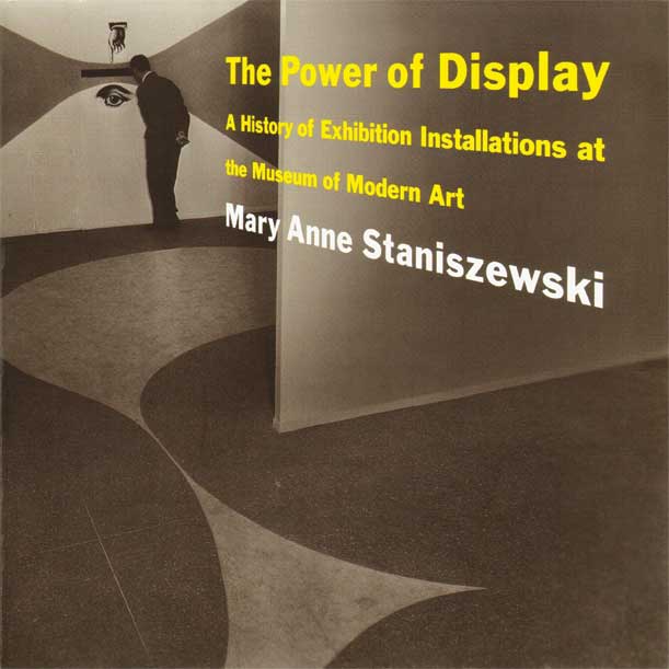
The Power of Display. A History of Exhibition Installations at the Museum of Modern Art, by Mary Anne Staniszewski. Published by The MIT Press, 1998.
I spent quite a bit of time initially trying to construct a sense of what this discourse for these museological/exhibition/curatorial/artistic practices would be. I went through artists’ primary documents and art history, but also industrial-type exhibition manuals, and there were also a few key texts on exhibition design. Except for Christopher Phillips’ article on MoMA’s photography shows, there was almost no literature that incorporated these installation photos. Although the book came out at the end of 1997-beginning of 1998, the text had been finished at the end of 1994, and the publications on exhibitions and display of the mid-1990s were not in print when I had been doing my research. As the book was being produced, I added citations for many of these texts in the notes.
P.B. - MoMA is, like most American museums, always very protective of any book, article or essay that gets published related to their institution. As a matter of fact, their press department always wants to control what gets written, so much so that it borders directly on censorship. How did you manage to get the book published?
M.A.S. - I had to wait close to a year to gain permission to access the museum papers. I resorted to writing the museum director, Richard Oldenburg, and he responded fairly quickly and gave me permission to do this research.
Additionally, the museum had a policy of not granting reproduction rights for more than 25 percent of the images of a book that was not a MoMA publication. I had taken the risk of working for a decade or so knowing of this restrictive museum policy. In the end, I was granted special permission for these rights by Patterson Sims, director for education and research support, and by the museum’s publication committee. Mikki Carpenter, who oversaw the installation photo archive, was also a member of this committee. I will always be immeasurably grateful to them for their decision that allowed me to document this history.
P.B. - The book is also generously documented with many important photos of MoMA’s exhibition history.
M.A.S. - Yes, the work for this book is representative of a certain kind of visual analysis, and although more traditional types of historical and theoretical research and analysis are key to the book, the project involved years of studying and analyzing these visual documents. I reviewed the archives of close to 70 years of exhibitions repeatedly and obsessively to construct what was my version of this history. I had to select what might be called the paradigmatic exhibitions and the paradigmatic image or images from each of the exhibitions selected. I loved analyzing documents that were visual. I think a person would have to have found it fascinating to have done it so repetitively and for so many years. There is still so much to be done with this history. I viewed my work as only a formative beginning.
FROM THE UNIVERSAL MUSEUM TO THE MODERN ART MUSEUM
P.B. - With Alfred Barr, Jr., we moved from the typical ‘Louvre salon-style’ exhibition model, which characterizes the so-called Universal Survey Museums like the Metropolitan, Prado and V&A, to the so-called ‘white cube,’ which still is the model for modern and contemporary art museums and centers worldwide. What artistic and non-artistic inspirations do you think Barr had that contributed to his iconic and creative exhibition installations?
M.A.S. - From my point of view, so many of the Universal Survey Museums like the Met, which is the survey collection I am most familiar with, did adopt a version of Barr’s ‘modernist’ display style.
In these Universal Survey Museums, artworks are not stacked from floor to ceiling or hung closely to one another according to their shape, size, and general color without reference to the internal themes and content of the display or exhibition, as they generally were in private and public collections before the 1920s and 1930s. Paintings are isolated on walls, artifacts or figures/sculptures, such as a Greek vase or non-Western works, are placed on pedestals and in vitrines, often in very isolated and decontextualized settings. A good example of this can be seen in the photographs of the Prado’s 19th-century galleries on the museum’s website.1
I do want to stress that there has certainly been a shift to create more historically representative installation contexts in recent years, but these often involve the slight ‘gesture’ of painting the gallery walls what are presumed to be culturally appropriate colors that may evoke something of the works original contexts. Wall labels nowadays also give better contextual information. Examples of these changes can also be seen with the Prado’s current installation photographs and videos that it has on its website.

Alfred H. Barr, Jr. looking at Alexander Calder's Gibralter (1936) at The Museum of Modern Art, New York, 1967. The Museum of Modern Art Archives, New York. Photo: Dan Budnik.
However, in terms of most museum displays overall, from a fundamental and broad view, the autonomy of the work of art is stressed, and the original function and meaning of the works are subsumed by the aestheticizing and transformational ‘power’ of the art museum. Or, you might say, by ‘the power of display.’
Regarding Alfred Barr’s influence, I believe the strongest influence was his awareness of the experiments of the European avant-gardes. I interviewed Philip Johnson as part of my research for the book, and Johnson, who had been curator of MoMA’s architectural department from 1932-1934, spoke very explicitly about these influences on Barr, citing “the way exhibitions were done in Weimar Germany-at the Folkwang Museum in Essen especially,” and what he described as “the famous rooms of Alexander Dorner in Hanover.”2 Barr and Johnson had traveled throughout Europe in the 1920s and 1930s, separately and together, and both were interested in these new types of displays. Johnson also very memorably for me stressed how they did not think the walls should be white, which they believed drained the color out of an art object, and they used a beige color and thought cloth on the walls was better. As Johnson said to me: “Never, never use white for painting.”3
Nowadays, of course, white is the standard color for the presentation of contemporary art, and due to issues of scale and site, the spacing between pieces can sometimes be enormous. Consequently, our exhibition experience is often an exaggerated caricature of these earlier formulations.
P.B. - Already in the first exhibition, “Cézanne, Gauguin, Seurat and Van Gogh,” held between November 7 and December 7, 1929 at MoMA, the role assigned to the spectator in Barr’s philosophy was of pivotal importance.
M.A.S. - First, as I often like to underscore, Barr’s first public creative contribution at the Museum of Modern Art was an installation design. He did not ‘curate’ the first MoMA exhibition in 1929-the museum’s director, A. Conger Goodyear, selected the works for the first show, “Cézanne, Gauguin, Seurat, Van Gogh.” But Barr did install the exhibition, and he did so with what he self-consciously considered to be an innovative and experimental display technique of hanging paintings on beige, light-colored walls with the works placed at so-called ‘eye level,’ isolated from one another. As Barr’s wife, art historian Margaret Scolari Barr, later recalled, in a tellingly anthropomorphic way, “The idea was to let the pictures stand on their own feet.”4
This type of display manifested an attempt to obliterate all possible contextual references, such as architectural details that would date the building like wainscoting, wallpapers and so on and to create what could be called an idealized space. But, of course, this was a historically specific type of interior. Barr also isolated the works from one another, which was extremely different from conventional Western art display practices.
Viewers then found themselves in what could be described as seemingly idealized interiors, facing one-on-one with ‘the Cézanne‘ or ‘the Gauguin,’ and so on-I am here emphasizing the tendency to speak of a work of art as if it is a person.
So this ‘project’ of installing these artworks created a sense of idealized autonomy for both that which was viewed and for those who were viewing it. The works of art were framed, but so were the viewers. In a very fundamental way, these types of installations can be seen as experiences that heighten a sense of individualism and an idealized, ahistorical subjectivity.
P.B. - You mentioned Philip Johnson before, who was in charge of MoMA’s Architecture and Design Department. It is particularly striking that the shows he supervised or undertook himself-think of “Why America Can´t Have Housing,” “Machine Art”-were audacious, innovative in terms of display, and blurred the line between high art and popular culture. Barr supported these shows totally but did not accept this type of display in the traditional realm of fine arts. Is this not a strong contradiction?
M.A.S. - Yes, you are making an interesting point. But I would first make a distinction between the two Johnson exhibitions you reference. The “Machine Art” exhibition of 1932 I see as very similar in concept and installation design to the work of Barr. Although the pieces featured in “Machine Art” were objects of everyday life, they were framed as fine art, on pedestals, in vitrines, and set in other types of displays that aestheticized the selected items. This, I believe, was part of the astounding popularity of this particular exhibition. It ‘made sense’ to the critical and general public: Everyone visiting the museum and seeing this exhibition was looking at ‘Art.’
The “Machine Art” displays functioned similarly to what we, as a culture, have done to artifacts from pre-modern or non-Western cultures when we place these items in conventional museum settings and to what has become the standard practice for the neutral modern/contemporary installations. The presentation of those bits and pieces, of machine art was similar to what we, as a culture, so to speak, did by framing, for example, The Venus of Willendorf as an art object. And, as you point out, these aestheticizing types of displays were the standard and preferred method for Alfred Barr.
But Barr and Johnson were working during what I consider the ‘laboratory years’ of the museum and the formative decades for the development of modern art and gallery institutional conventions. So while this aestheticized display was Barr’s preferred method, he did depart from this idealized realization.
Barr’s paradigmatic exhibition of 1936, “Cubism and Abstract Art,” was not just a show of paintings on walls and sculptures on pedestals. Due to Barr’s educational intent and the practical limitations of not being able to acquire some of the actual works of art at that time, the exhibition was, in many areas, a mix-media didactic display. Certain walls looked like an organized ‘collage’ of documentary photographs, reproductions, posters, film stills, didactic labels and placards, with not only paintings, but also chairs hung on the walls as well. These sections of “Cubism and Abstract Art” were similar to Johnson’s “America Can’t Have Housing,” which was a didactic collaborative project involving MoMA, the New York City Housing Authority, the Housing Section of the Welfare Council, Columbia University and the Lavanburg Foundation (a low-income, non-profit housing corporation). Johnson supervised the exhibition, but the wall texts were written by Carol Arnovici of Housing Research Bureau; the installation was created by the architect Woodner-Silverman, assisted by photographer Walker Evans; and G. Lyman Payne of the Housing Authority was the technical director, so this was a very experimental, activist exhibition dealing with the need to design low cost housing.

Visitors at the exhibition “Useful Objects of American Design under $10,” on view at The Museum of Modern Art, New York, November 26–December 24, 1940. The Museum of Modern Art Archives, New York.
And yes, I completely agree with you that Barr’s practice of installation design, for the most part, featured idealized and aestheticized contexts for works of art and their viewers. However, Barr, I think, envisioned his work as something in dialogue with the practices of the international avant-gardes of the first half of the century. And, as you noted, he supported exhibitions like “America Can’t Have Housing,” but it is interesting to see that his public statement, published as part of the publicity of the show, stressed the importance of “the artistic or architectural side of housing.”5
While Philip Johnson could have a mega success of an exhibition composed of things like some screws on a velvet-covered pedestal, Barr, in the end, was not so successful when he ventured in related areas. As the story is often told, Alfred Barr was ‘fired,’ or forced to resign, by the board of trustees, in part, for showing a highly decorated shoeshine stand and stools, which the then board president Stephen Clark apparently abhorred. Louise Nevelson introduced Barr to this colorfully bedecked work encrusted with ornaments created by Sicilian immigrant Giovanni Indelicato, which was exhibited in the museum’s lobby as Joe Milone’s Shoe Shine Stand during the holiday season from December 1942 to January 1943. Although recent scholarly research emphasizes that Barr’s authority and status with the board in the late 1930s and 1940s had been eroding, his curation of this shoeshine exhibit and another exhibition featuring another self-taught painter, Morris Hirshfield, have traditionally been the reasons given for his being sent into retirement.
IDEOLOGY THROUGH (A)POLITICAL, NEUTRAL APPROACH
P.B. - Yes, I think his reputation was being eroded a while ago, but I did not know about the shoeshine stand incident. Barr’s modernist autonomous aesthetic displays reveal a profound ideological twist through a seemingly apolitical and neutral approach.
M.A.S. - Yes, this is what struck me so profoundly about all the works of art most of us see in museums. The installation design functions to reframe in a very, very strong and very powerful way the meaning of the experience and the meaning of the work of art.
This emphasis on a decontextualized, idealized and aestheticized context for modern and contemporary works of art is even more ideologically aggressive and transformative in installations of pre-modern (that is, before the late 18th century) and non-Western works. These objects and images from various cultures that were created for some primary function or purpose other than art-as-we-know-it are then framed by these museum/gallery conventions and turned into ‘Art.’ These installations then serve to transform these traces of these cultures and reframe them within what could be called the orders of ‘the West.’ Of course, by the late 20th century, the practice of this modern concept of art had been adopted, on some level, by most cultures globally.
Finally, I will add that Barr’s successor, René d’Harnoncourt, whose work is so interesting and needs more analysis and research, stated that “There is no such thing as a neutral installation.”6
P.B. - This was clearly the case with Barr’s and MoMA’s political engagement with the U.S. Government that proved to be very profound during the war years in the 1940s. Think of exhibitions of photography, exhibitions like “Road to Victory,” “Power in the Pacific” and “Airways to Peace,” which were curated by Edward Steichen and Monroe Wheeler, and, with the exhibition design of Herbert Bayer and George Kidder Smith, offered a kind of innovative walk-through exhibition.
M.A.S. - Yes, in these overtly propagandistic exhibitions, the political dimensions were, in many ways, very ‘transparent’ and overt. In later years, in the late 1960s and 1970s, the political and economic dimensions or interests become rearranged. Many of the institutional political-economic dimensions go underground in the form of underwriting and other mechanisms. The overt political and economic messages are, in many instances, ‘safely’ re-inscribed within the ‘signature’ of the artist, and this can be seen in the practice of site-specific installation work.
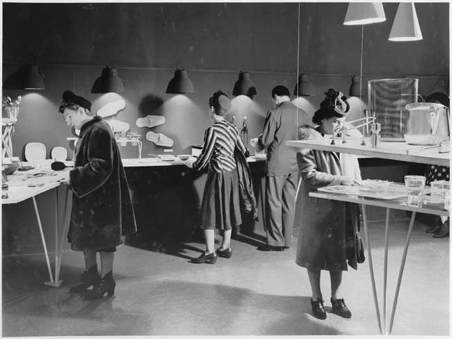
Visitors at the exhibition “Useful Objects of American Design under $10,” on view at The Museum of Modern Art, New York, November 26–December 24, 1940. The Museum of Modern Art Archives, New York.
P.B. - This openly propagandistic involvement of Barr and MoMA, especially during the Cold War and the repackaging and touring internationally of exhibitions with so-called apolitical themes, have always been considered a polemic aspect of MoMA’s unholy alliance of culture and politics. To what extent did this affect Barr´s and MoMA’s position and credibility?
M.A.S. - The status of Alfred Barr and MoMA’s credibility really depends on who is doing the assessment. There is a spectrum of aesthetic and political positions, subcultures or microcultures, and audiences that might make such a consideration.
There is now a well-known body of literature that critically addresses the appropriation of the mid-century U.S. avant-garde (I am using the term as it was commonly applied in mid-century to mean modern art) as a weapon in the Cold War and, specifically, the U.S. Federal Government and the C.I.A.’s support of certain MoMA exhibitions, and other entities, such as Partisan Review. These facts have been incorporated into most mainstream interpretations of this history at this point. I think someone with a more left perspective would see this more critically than someone with a more centrist-liberal, or right-wing, point of view.
P.B. - But still, most exhibitions on Abstract Expressionism-see for example the most recent exhibition “Abstract Expressionism” at Guggenheim Bilbao-refrain from any critical analysis remaining on a pure formal level. But let’s focus on MoMA´s collection. For Barr, modern art was basically Cubism and Picasso as the artist-hero ending with Abstract Expressionism, what we can see displayed on the fifth floor. His formalist vision was a historical staging of the liberal bourgeois grand narrative of individuality, freedom and subjectivity. Even moral or political works like Picasso´s Les Demoiselles d’Avignon or, even more so, Guernica, were totally depoliticized, and there was no room for artists like Hopper in his ideal comprehension of modern art.
M.A.S. - First, to give a brief update: Since 2016, there have been official reconsiderations of MoMA’s collections to have more integration of the different media. There is also now less space due the building expansion project overseen by Diller Scofidio + Renfro in collaboration with Gensler architects. Currently, the fifth floor still does span from the late-19th century work to mid-20th century abstraction. The mixing of the different media has not impacted these earlier installations so greatly; however, there is a slight reduction in the number of galleries due to the renovation.
Your description matches what has been, since the 1970s, the overall character of most of the museum’s collection installations, which I see as an exaggerated articulation of very reductive, aestheticized versions of ‘modernism,’ here using the term to mean more aestheticized practice, as opposed to what I often describe as ‘avant-garde’ more art-into-life experiments. I will add that in the very recent decades, the curators overseeing the design and architecture exhibitions have often departed from this more reductive aestheticized model.
To my mind, an interesting way to frame this is to look at the second gallery on the fifth floor, the Picasso gallery, titled, “The Cubist Revolution.” MoMA frames Picasso’s great contribution as ‘Cubism,’ and if there is anything revolutionary about Picasso it is ‘Cubist.’ I see such an interpretation as reformist, or perhaps more accurately, conservative, and this is not what I would feature as revolutionary about this artist’s work. Yes, Cubism is an innovative experiment, but it remains representational. It is not as radical as going completely abstract, which is what artists like Kandinsky and Malevich do. Picasso remains representational, and in the Cubism work, he remains very respectful of the paint-on-canvas tradition and the limits of a painting’s frame.
The really revolutionary contribution is collage. With the invention of collage, Picasso (working with Braque) breaks open the autonomous, sacred space of the artwork’s organic materials of canvas and oil paint and disrupts the ‘naturalness’ of this space by including mass-produced, machine-made, found objects from everyday life. This innovation can be seen as a critique of the authorial and medium-specific mythology of modern art and the articulation of self-hood as an idealized, individualized signature of ‘style.’
The invention of collage is the revolutionary gesture, contribution, innovation, and this is akin to Duchamp’s ready-made experiments occurring at the same time. The collage and readymade literally open up art to the world beyond and reframe notions of self-hood so that the concept of self, and the domain of creativity, is linked in a new way to history and culture.
There are no collages in MoMA’s Picasso gallery; collage does not figure in this tale of modern art history, and MoMA, if I can anthropomorphize this museum, remains blind to the revolutionary implications of this innovation.
And yes, the ‘reformist’ Picasso remains the key artist in this story. There are, according to my count, 14 galleries on the fifth floor, arranged in chronological order, with several devoted completely, or almost completely, to one master. But Picasso remains exceptional in that his work is often included in these other galleries, so he is presented, as you described, as the ‘artist-hero.’
Another way to interpret MoMA’s vision of modern art is to look at this in terms of the very clear issue of the inclusion of women artists. What could be called a rationalist and masculinist abstraction has dominated MoMA’s version of this history. The former term is related to what was featured about an artist’s oeuvre, but, for this discussion, I will just focus on the latter. This emphasis on the masculine characterized MoMA’s presentation of their collections and exhibitions through to circa 2010, when there began to be more consistent inclusions of art created by women in the museum’s programming.
Recently, however, I have seen an almost shocking revision of whose art is shown at the museum in certain temporary exhibitions based on the collections. I found the “Making Space: Women Artists and Postwar Abstraction,” which is up through August, to be revelatory.7 As I walked through the galleries, I kept saying to myself, “Why had I not seen these magnificent works before?”
At the beginning of the show is a small jewel of a painting completed in 1946 by Janet Sobel, in which she used a drip technique to create this distinctly beautiful work, which prefigures Pollock’s achievements. It could be argued that Pollock did more, went performative and stood in an expanded landscape of painting, but for the innovative technique of dripping instead of painting-with-a-brush-that made me see the connection to surrealist practices ever more closely-the Sobel is certainly an important and historic work.
There were so many other amazing revelations. Magdalena Abakanowicz’s Yellow Abakan of 1967-68-a huge textile, a swath of cloth, draped on the wall, the fabric woven from sisal, an industrial plant fiber used to make rope-is similar to the famous Robert Morris felt pieces. But Abakanowicz’s piece, which has sometimes been sequestered within the category of ‘fiber art,’ can be seen to raise related but different questions than the Morris in brilliant and important ways.
Finally, earlier this past year I had an even more viscerally dramatic experience when visiting the exhibition of selected works from the collection titled “A Revolutionary Impulse: The Rise of the Russian Avant-garde,“8 and many of these revelations were mirrored in a different way in the Design and Architecture collections exhibition, “How Should We Live? Propositions for the Modern Interior,”9 which featured the contributions of women architects and designers, such as Lilly Reich and Eileen Gray, very prominently.
The entrance gallery of the Russian-Soviet show was quite stunning, with a large video projection of the 1927 compilation film The Fall of the Romanov Dynasty by Esther Shub, identified with a wall label attributing the innovations of montage to Eisenstein, and to Shub. This was paired with a Popova abstraction on the adjacent wall next to the introductory wall text. The rest of the exhibition’s galleries were installed with arrangements that included, in a significant and unusual way, the works of artists who were women in a fully integrated fashion.
That women were so prominent in an exhibition about the Russian-Soviet avant-garde is especially appropriate given the fact that the 1917 revolution was ignited, in large part, by the protests of women on International Women’s Day in March (February according to the Russian Julian calendar) of 1917.
MoMA’s CANON OF MODERN ART…AND THE NEO-LIBERAL MUSEUM
P.B. - As such, the fourth floor and the rest of the collection-Pop art, Conceptual art, Minimalism, Performance art et al-does not fit Barr’s narrative, and it still seems to me like an artificial or extraneous addenda. Wouldn’t it be more logical to provide a new reading of Barr’s narrative in order to make the whole collection-the post-Barr additions-more coherent? What I mean to say is that there is no real chain or link between the two, especially as Barr’s rooms are linked in such a way that they follow a prescribed route, an iconographic program.
M.A.S. - When you refer to the fourth floor, this was for work from the mid-century through to the 1980s, and the more contemporary galleries were on the second floor. The third floor had prints, drawings, design and architecture galleries, but currently the third, fourth and sixth floors have temporary exhibitions.
The museum’s vision of 20th-century art is quite different from mine. I see circa 1912 to 1915 as critical years, when the conventions of art are questioned by certain artists. You have total abstraction as one direction; and collage, which can be seen as a critique of key myths of art and creativity, as another; and the readymade, which functions to go even further to reveal the historicity of art as a cultural invention and practice. The latter two innovations open up art to the universe of everyday life and the diverse practices that are now realized as art, from works created from found objects to activist interventions and rearrangements of all aspects of our social worlds. Can a museum like MoMA be fully engaged with what has broadly been considered art for 100 years now is a good question.
MoMA has made this relatively recent official decision to try to integrate diverse media, but the fifth-floor galleries have not been greatly impacted by this, and there are still relatively few works by women. The recent temporary collection exhibitions, however, have offered a more inclusive sense of the possibilities for modern art, on certain levels. Also, this February, MoMA performed a highly unusual political intervention into its own canon and installed works created by artists from nations whose citizens are being denied entry in the U.S. due to Donald Trump’s January executive order. These are beautiful and powerful works, but they are not usually seen in the permanent collection galleries, and similar to the art by women in the temporary collection shows, this gesture makes clear how non-aesthetic factors contribute to cultural validation and taste. Overall, it seems like the museum is in a transitionary moment, with many future expectations associated with the new building and expansion. So we shall see.
P.B. - There are interesting attempts to be more inclusive, especially in terms of gender at MoMA, but also for example at Tate Modern under the directorship of Frances Morris, which is a very positive development. My final question would be: Why do 99.9 percent of the museums of modern art and centers of contemporary art stick to the white-cube display-since we know exactly what Barr, Jr., ideologically pursued-while exhibiting exhibitions and art works that are very politically and gender motivated? It’s a great contradictio in terminis, as if the white wall is simply saying: You can hang whatever you want, but I will depoliticize it straight away! Why are museums and professionals so afraid of experimenting or moving away from the white-cube ideology?
M.A.S. - Yes, I agree with your statement that “Museums of modern art and centers of contemporary art stick to the white-cube display,” but I think it is important to add that such institutions have actually strengthened, exaggerated and enhanced this ‘modernist’ model.
What we have seen developing as modern and contemporary museum exhibition conventions in the decades after Barr’s innovative, mid-20th century, seemingly-neutral-and-ahistorical displays is a caricature of these earlier groundbreaking prototypes. (I will also note that Barr’s work is most renown, but this was part of a discourse of practices that included Dorner’s contributions and certain other examples.) During the late 1990s and early 2000s, in particular, I observed an exaggeration of the characteristics of these earlier interiors and discussed this phenomenon in the preface to the Korean translation of The Power of Display that came out in 2007 and in some other articles I published after I finished the book.
In terms of color, as I mentioned, Barr and Philip Johnson never would have used white in their installations. Johnson actually used some colors, in some instances like “Machine Art,” but Barr preferred monk’s cloth, which is beige, and this is a hue that is somewhere between white and very light brown. So there is this exaggerated bleaching of the color of the walls.
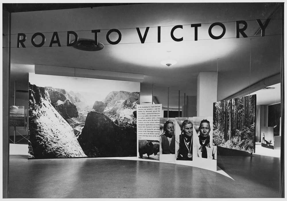
Installation view of the exhibition, “Road to Victory,” on view at The Museum of Modern Art, New York, May 21, 1942 through October 4, 1942. The Museum of Modern Art Archives, New York. Photo: Albert Fenn.
Additionally, the scale has become exaggerated as well. Some of this, admittedly, is related to the increase in size of many of the works of art, but, this nonetheless has manifested as an enhancement of scale and expanded distances between artworks. We see this clearly and paradigmatically in Frank Gehry’s Guggenheim Museum in Bilbao, which opened in 1997, and also in Yoshio Taniguchi’s redesign of MoMA of 2004. So the features of Barr’s (and others) early- and mid-20th century creamy-colored, domestic-scale, eye-level installations with works spaced with modest distances between them were transformed into electric-white, cavernously massive interiors with often great distances between works.
I see this affecting the viewers’ sense of self in these spaces: In these more recent installations, the individual is often dwarfed and the spatial relationships metaphorically evoke those akin to what could be described as corporate dimensions rather than the human. Politically and metaphorically, this is of interest to me, given my U.S. perspective, and the enhancement of corporate personhood in the United States in the 2000s, as seen in the Citizens United Supreme Court case, in particular.
This enormous scale was seen most paradigmatically in Bilbao’s large gallery where Richard Serra’s Snake (1996) was installed for the opening exhibition of the museum and in MoMA’s massive atrium where Barnett Newman’s Broken Obelisk (1963-69) stood alone at the center of the museum like a large phallic monument to the patriarchy for the opening installation of the Taniguchi redesign. Regarding Bilbao, Gehry went on record stating that he did not want this key gallery to be realized in such a gargantuan scale, and it was Thomas Krens, the Guggenheim’s director at that time, who had the last word on the non-human scale of the space. Krens is known for his initiation of a new model of entrepreneurial corporate branding and restructuring of the modern art museum with his work overseeing the Guggenheim, as seen in the creation of satellite franchise museums throughout the world.10
So rather than answer to your question about “Why are museums and professionals so afraid of experimenting or moving away from the white-cube ideology?” In terms of the ‘why’ and the ‘fear,’ I will take a bit different approach. First, I will acknowledge that there have been, of course, some museum experiments and realizations regarding exhibitions, projects and display and building designs internationally, and MoMA has selected an architectural firm that has been a leader in such creative innovation, Diller Scofidio + Renfro, for the current redesign, so we shall see.
However, to move beyond these mostly white, implicitly ahistorical, preserves for presenting modern and contemporary art would entail the development of a different kind of museum and for it to become the standard. This would necessitate a vision of the museum that is not something solely contained within a single building, but would be an enterprise that somehow permeates the social landscape. This would demand a different type of dynamic museum architecture that accommodates more fluid concepts of space and scale and changeability. This could be described as a descendant of Alexander Dorner’s ‘living museum.’
Expanding my earlier comment about MoMA to museums more generally, this would involve a paradigm shift in the concept of museums and the concept of museum architecture in order for this type of cultural institution to be fully engaged with what art has been for the past 100 years.
Notes
1. See “The Graphoscope,” The Prado, 2004, accessed April 30, 2017, https://www.museodelprado.es/en/whats-on/exhibition/the-graphoscope/81bfb972-aade-4c24-93b2-dbd7e26e5e4a
2. See Mary Anne Staniszewski, The Power of Display: A History of Exhibition Installations at the Museum of Modern Art. New York: MIT Press, 1998, 64.
3. Staniszewski, 64.
4. Staniszewski, 62.
5. See Untitled MoMA Press Release, October 11, 1934, accessed May 5, 2017, https://www.moma.org/d/c/press_releases/W1siZiIsIjMyNTAyMyJdXQ.pdf?sha=5838a56977e010b4
6. Staniszewski, 61.
7. See “Making Space: Women Artists and Postwar Abstraction,” Museum of Modern Art, https://www.moma.org/calendar/exhibitions/3663?locale=en&page=2 “Making Space: Women Artists and Postwar Abstraction” (April 15 to August 13, 2017), was organized by Starr Figura, curator, Department of Drawings and Prints, and Sarah Meister, curator, Department of Photography, with Hillary Reder, curatorial assistant, Department of Drawings and Prints.
8. “A Revolutionary Impulse: The Rise of the Russian Avant-Garde” (December 3, 2016 to March 12, 2017) was organized by Roxana Marcoci, senior curator, Department of Photography, and Sarah Suzuki, curator, Department of Drawings and Prints; with Hillary Reder, curatorial assistant, Department of Drawings and Prints.
9. “How Should We Live? Propositions for the Modern Interior,” (October 1, 2016 to April 23, 2017) was organized by Juliet Kinchin, curator, with Luke Baker, curatorial assistant, Department of Architecture and Design. As mentioned previously, in recent decades, the design and architecture departments have been more experimental and inclusive than those for painting and sculpture. The exhibitions curated by Paola Antonelli, senior curator, Department of Architecture and Design, in particular, have been very innovative.
10. ”Frank Gehry: Plain Talk with a Master,” Robert Ivy interview, Architectural Record, vol. 189, issue 5, May 1999, 357.
Paco Barragán is the visual arts curator of Centro Cultural Matucana 100 in Santiago, Chile. He recently curated “Intimate Strangers: Politics as Celebrity, Celebrity as Politics” and “Alfredo Jaar: May 1, 2011″ (Matucana 100, 2015), “Guided Tour: Artist, Museum, Spectator” (MUSAC, Leon, Spain, 2015) and “Erwin Olaf: The Empire of Illusion” (MACRO, Rosario, Argentina, 2015). He is author of The Art to Come (Subastas Siglo XXI, 2002) and The Art Fair Age (CHARTA, 2008).


