« Reviews
Todd Schroeder: TRANCE
Laney Contemporary Fine Art - Savannah, Ga.
By Lisa Jaye Young
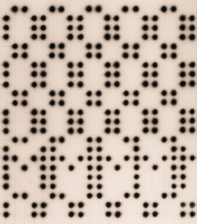
Todd Schroeder’s most recent exhibition of paintings at LANEY Contemporary Fine Art in Savannah is aptly named “TRANCE.” Paintings on canvas, newsprint and steel arrest the viewer in a visual and intellectual abeyance or conscious limbo of meaning construction. Figure and ground are in constant flux, holding the eye (and the mind) in an unsettled present. Dot matrices and grid structures flatten both time and image while colorful burnishing dots, like flashing afterimages, push and pull one into a trance-like state of continuous flux. Dot and ground, data and grid, meaning and its resistance, the expediency of information and the glacial pace of response, “TRANCE” recognizes instability as the new normal.
Often painted on slick, non-absorbent surfaces such as plexi or steel or Tyvek, or the ephemeral surface of The New York Times newsprint, Schroeder’s work has always resisted a certain easy settling into definitive meaning. The combination of air-blown, untouched dots and brushed gestures contributes to a dialectical consistency, always in flux, in conversation between Pop and abstraction, between statement and erasure.
HA (2017), a tall vertical painting of acrylic, atomizer-blown dots on canvas is the first Schroeder painting to oscillate the eyes at the top of the stairs at Laney Contemporary, a gallery which is quickly assuming the long-needed role of an independent and visionary, community-minded art center on the periphery of town. HA announces the dot matrix that has appeared in various forms in Schroeder’s paintings over the years, as it offers not only a visual ‘point’ of reference but is itself already a built-in method. The matrix is both image and practice. It is a conceptual organizing principle. The title HA reads as both casual laugh, and “gotcha!” It announces the idea that sound bytes like HA and single letters, such the giant X in the largest painting entitled X that inhabits the main wall in the central gallery, may signal more than meets the eye. In other words, the matrix is never just a matrix, just as the grid is never just a grid. One sound or letter or expression, like an X, marks the place of, indexes, an additional layer of meaning or a more comprehensive idea.
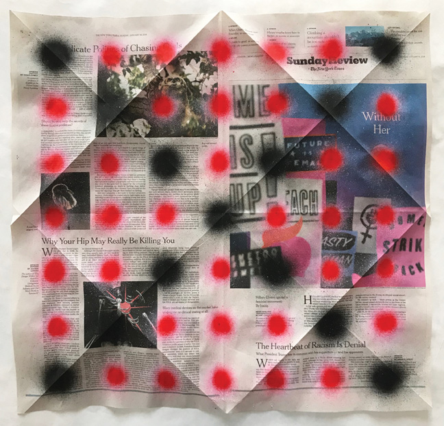
In “TRANCE,” letters themselves are open-ended icons (images full of signification) suggesting the role of the newspaper reader, the citizen, and the consumer. X may mark the spot of the viewer as too accepting (X), too rejecting (X). The letter Y also built into the dot matrices suggests questioning (Y), prodding, asking. The letter Z, which hovers over some of the paintings included, connects with the idea of the trance as a kind of waking sleep (Zzzzs), non-presence, or escapism. In this sense, the letters, semi-hidden within the paintings as both structure and form, oscillate as both image and text. An X, for instance, used frequently in this body of work, marks the spot and covers it up. It indicates erasure and goal completion at the same time, placing Schroeder’s practice within a legacy of language-based conceptual abstraction. His work, as will be discussed, may be seen as part of art history since the 1970s in which the establishment of structure, conceptual parameters, and routine are essential. Schroeder’s NYT X series of acrylic on newsprint in the main gallery space represent roughly a year (May 2017 through the present, with no fixed end date) of chosen Sunday New York Times pages. Time-stamped structure in Schroeder’s work is, however, flexible enough to connect with the mess of paint and the embrace of serendipity as dots, blown with an atomizer through an overlaid grid, settle unexpectedly on a fashion model’s nose, a politician’s face, a gun. The artist notes of his process: “It was in response to the election and the shift in my awareness of the news-the choice of The New York Times is due to its status as one of the most prestigious vetting institutions in the world (”All the News That’s Fit to Print”), also, its perceived liberal bias, and it’s Trump’s hometown newspaper. And yes only Sunday-for several reasons, I wanted to choose a day and pick only from that day. I didn’t want to chase the “perfect” images/pages around all week. It gives me a structure that imposes some limits and gives me a little less subjectivity.” The paper can be manipulated, folded, punctured, painted on and through-the lightness of surface, a kind of lightness of being masking the much larger prodding questions of daily events, daily existence. The NYT X series, in this sense, marks a weekly practice of time keeping by which the lightness and weight of existence converge in the act of painting.
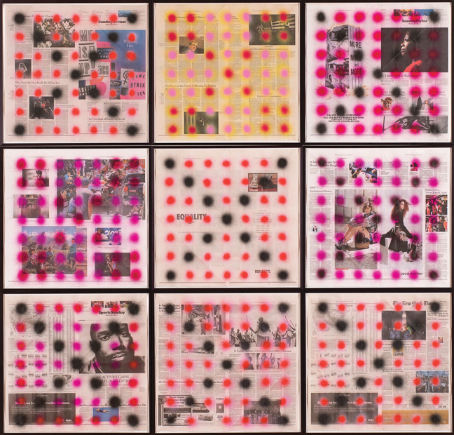
Todd Schroeder, NYT X, 2018, grid of 9 papers from “TRANCE” exhibition, acrylic on newsprint, 69” x 72,” overall. Photo: John McKinnon.
![]()
A narrow hallway punctuated by medium-scale slightly earlier acrylic paintings on sheet metal provides passage into the main gallery while also setting up a mini-art-history of Schroeder’s oeuvre and we see the evolution of the dot and the figure-ground palimpsest that results. Pop dots of black and pink hovering under or over singular Ab Ex gestures seem to freshly glaze on the surface. Dots and splashes, strokes and swipes vie for attention, prefiguring the dots taking the form of letters in the main space which seem to flash like Op art back and forth on the gallery walls. Titles like OM, X, and Fat Chance, touch upon text and the role of serendipity or encounter. Schroeder has compared these works to CAUTION signs along a highway in which LED circles of light combine to flash urgencies of text requiring the driver’s (the viewer’s) immediate response. The paintings insist that the viewer, like the driver, pay close attention and look away at the same time. The fuzziness of colored bright pink or black dots or the pointillist combinations of the two, do not allow the eye to rest, but they seek an active participant, willing to see the forest for the trees; to see the image (as text or letter) and/or the encoded patterns that hide within plain sight.
Each large-scale painting (on average 70 x 60 inches each) is guided by the implied infinitude (and limitations) of the grid, represented by purple or orange chalk lines. The grid locks in the dots, as if in a sniper’s crosshairs. The grid can never be underestimated. Its formality implies here a structural, symbolic, and actual organizational tool for cultural, visual, and temporal control. The term trance paired with the grid and this back and forth, in and out of focus access to the image, should be a reminder that it is the grid, in its many manifestations, that keeps us entranced, ordered, distracted, and directed.
The grid together with the dots cannot help but remind the thinking viewer of signification as a political act. The grid also connects these large canvases back to the NYT X series on newsprint on the other side of the gallery. Again, with this important new work, the newspaper choice is itself a political act, but also a likely natural choice for an artist whose formative years were spent in New York City. Unfocused dots of bright, almost neon graffiti-esque color, approximately 1-2 inches in diameter each, spray outward as they are blown through a pinhole (using an atomizer) onto chosen Times newspaper sheets. The dots are blown through an overlaid grid and indicate the presence of an X, a Y, or a Z on a single page, as suggested above. The color is saturated at the dot center and lightly splatters outward into fine splashes, a kind of indirect gunshot reference. In one image from Charlottesville 2017, neon pink delicately splatters outward over an already distressed falling body in the photo-journalistic image of this gruesome scene of protesters being violently hit by a crazed white supremacist’s vehicle. Tens of photographers can be seen in the image itself shooting the scene rather than assisting as it tragically unfolds. The image is chilling and even more so as the dots point to and erase the scene at the same time. The eye moves into the image and its implications and then back to the surface, the act of looking itself a kind of movement between deep dive into the detail’s establishment of meaning and coming up for air to the surface, the present, the intangibility of an action in the past, even if recent.
As Schroeder notes in his artist statement: “Newspapers are irony machines.”1 Juxtapositions of newspaper content, both intentional and serendipitous, abound. Read through the lens of visual culture, and through the flatness of the overlaid grid of abstracted eye-attracting, and distracting dots, a flat equality emerges between what we see in and on the newspaper pages. An NFL activist (a new term for certain!) on one page is equated with a NIKE swoosh brandishing the bold text: EQUALITY on another page, another day. Player and brand are treated equally. Brand seeks equation with equality as both become advertisements. Event and advertisement seem frighteningly reduced and equated. The uniformity of the dotted page levels the two, calling attention to both without differentiation. In the central panel on the gallery wall, nine of these square-format separate pages of the Times are combined to form one large grid, a calendar re-imagined. Within this artist’s well-established exhibition history, abstraction is a kind of poetic-conceptual response to the passage of time and the slippage of perceptual accuracy; a calendar of events flattened, equated, for all to see.
Moving back and forth between text and image, structure and accident, event and signification, Schroeder’s work has maintained a kind of Smithson-like site and non-site characteristic. In Smithson’s work, the site was represented by the exterior landscape, the soil or the materials of an original location and the non-site was understood as the interior proxy, the cultural index (museum/gallery) or secondary, layered expression of the original. Schroeder’s works often set up a similar parallel as gestural abstraction fuses with a Pop singularity (Philip Guston also remains a significant figure in his approach). For instance, in past works an exterior Pop cultural point of reference such as American Kung Fu actor David Carradine, a song lyric, or a minor American folk underdog legend such as Stagger Lee (who has been referred to by everyone from Waring’s Pennsylvanians in the 1923 to The Clash), function as the original site, while the painting referencing it functions as the non-site. Painted gesture posits and obliterates meaning. Gestures are often paired with text as irony or text as a reference point to musical lyrical moments, pop-heroic figures or anti-heroes. The non-site is the new painting, the site is not only the original story about a character, but the ongoing mythological historiography of appropriations of a character and all of the many permutations of image, song, text that move and change with the slipperiness of history and the re-imaginings of a story or an event. Fast forward this method as a thread in Schroeder’s most current work at LANEY Contemporary and we see a mature, full-circle (pardon the dot puns) body of work that participates in this kind of site and non-site operation, back and forth, in focus and out. The dots, in the vein of Sigmar Polke’s Pop-ironic occlusions or Baldessari’s solid, primary-colored obliterations signal what is there and not there. They signal what you may see, and what is either systematically obscured by the one in control of the images or willingly ignored by the viewer/reader. In some ways, the dots in “TRANCE” act like the Xs crossing out images that can still be seen in Basquiat’s work: the act of marking out obscures, and calls attention to something. It calls attention to it being obscured. In Schroeder’s NYT X series of acrylic on newspaper current event images and words, advertisements and brands, both facts and fictions are obscured as a mode of pointing to them.
Continuing in this vein, the original act or the event in the world was the site while the photo-journalistic image or YSL bag advertised in The Times, interchangeable under the brutally flattened lens of a grid, assumes the position of the non-site. The newspaper photograph of the event is also the non-site. The site was in the past, and the non-site is in the present. Layered on top of this is the grid and dot matrix. The grid is also a kind of non-site itself, acting as proxy, indexing, ordering the facts, arranging the sites (sights) for re-presentation. In this sense, the news and cultural events also take shape daily through the gridded, non-verbal order of the clock, of the calendar. Schroeder’s method of clocking time and clocking practice by way of news, while calling upon chance as a way to point our eye in a hierarchy of “look at this, not at that, don’t look at this, look at that act,” seems also a way to slow down time or try to find some order within an ever-increasing perception that events are coming at us with an unprecedented speed, faster than we can process. This speed creates a newly ripe condition for a kind of trance-like reception, similar to observations of this that were leveled at the sleep-walking European masses in the 1920s and 30s by the Dada artists. They similarly pointed to the voting citizenry as being entranced followers. And if the newsprint version is that much slower than its digital replacement, these paintings of marked time, real place, and image space, site and non-site, offer an intuitive gesture, and an urgent wake-up call that rather than moving back and forth seeing and not seeing, that we snap out of it and see the trance (distraction) for the grid (power structure) that it is.
Like the Renaissance picture plane, in “TRANCE,” we look through the gridded composition and also at it since the grid is transparent until it is named; unseen and implied until noticed and made visual as the unrelenting power structure of modern industrialized capitalism and all of its related systems: newspapers, production, consumption, urban and suburban development, electricity, the Internet. Grids embedded within grids. Having often referenced the flat farm fields of western Ohio where he grew up, Schroeder mentions the grid as the aerial order of the land, the layout of the powers that be. As he underlines in his artist statement: “Grids hold things up…[and] break things down.” Schroeder’s “TRANCE” is exhibited in conjunction with L.A.-based artist Kevin Cooley’s installation entitled Smoke & Mirrors; the two were cleverly merged by LANEY Contemporary in this exhibition, as both shows attest to a quickening pace of reception, the need for and the inability to respond to each event fast enough and the mechanisms for control to which we adhere, or against which we resist.
Xs and Os and grids in “TRANCE” map out a kind of tic tac toe futility, marking the passage of time. Is the vanitas reminder itself a timeless device? Or is vanitas and its reminder of the need to get our acts together because of the fast passage of time itself desperately relevant, more needed today than ever? In a culture of here and now, Schroeder’s “TRANCE” holds us still, in between, but hopefully only for a moment.
(April 26 - June 9, 2018)
NOTES
1. Todd Schroeder, accessed June 10, 2018, http://www.toddschroederartist.com/statement
Lisa Jaye Young, Ph.D. is Professor of Art History at The Savannah College of Art and Design. She earned her B.A. in Art History from The University of Pittsburgh. After working in Berlin as an independent scholar and art writer, she was co-director of Deitch Projects, and completed her doctorate in Art History and Cinema Studies at The Graduate Center, City University of New York. She was full-time faculty at SUNY Nassau College and served as the campus Art Gallery Director. She has contributed criticism to Burnaway, Aint-Bad, Art Review, Tema Celeste, and Performing Arts Journal, among others. She is an Editor for Aint-Bad Magazine (https://www.aint-bad.com/). Her research and teaching emphasize the history of photography, feminism, and a visual history of capital.
Filed Under: Reviews















Leave a Reply
You must be logged in to post a comment.