« Features
An Interview with James McMullan
Robert Capa called it the decisive moment. Andrew Wyeth called it the third dimension of realness. Georgia O’Keeffe called it the fragmented whole. It is the ability to orchestrate a concept with a visual element that gives birth to a third dimension of seeing. Few artists in history have had the consistency that McMullan has. Now at age 84, he has produced over 84 posters for Lincoln Center and created work for every major U.S. American magazine. He is held in high esteem and respect among the world’s greatest designers. His watercolors transcend illustrations to capture an oeuvre all his own.
Daniel Bonnell - You were born in Tsingtao, North China, in 1934, and exposed to Asian culture-one of balance and Zen approaches to drawing and art. Did this experience inform your art in any way?
James McMullan - Since I have always taken pleasure in the immediacy of drawing and its reflection of the moment in which it was made, I think the Chinese paintings in our Cheefoo house had an influence in that attitude. I have never been attracted to art that is painstakingly rendered to achieve illusory effects. I also respect that drawing can reveal the struggle and imperfection of its creation as well as the energy and beauty of its subject. In a general sense, I believe in the Confucian idea of balance and its respect for tradition.
D.B. - Can you share your early experience with PushPin, and your relationship with designers Milton Glaser and Seymour Chwast?
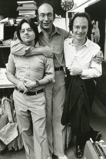
J.M. - I joined PushPin in 1963, as a result of Seymour Chwast and I being part of the same life drawing group. After he got to know me, saw my drawing skills and my burgeoning career and heard my complaints about dealing with clients, etc., he invited me to join the studio. It was already a very famous group, but I had some hesitation about giving up the independence of my freelance career and fitting my realistic work into their more patterned and stylized approach. Milton reassured me that I didn’t have to change my approach and that I would find a way to collaborate with him and Seymour; I joined.
Milton’s work always had a basis and connection to observation and to realism, and my work always contained an implication of flatness or at least a tension between the round and the flat; so we found, as I worked alongside him, that we were not so different philosophically. I learned a lot about design and real graphic drama (I was always a little understated). I hope I contributed something about the possibilities of a more psychological realism. In any case, we all became good friends, and Milton and I have seen each other regularly through the years and until the present.
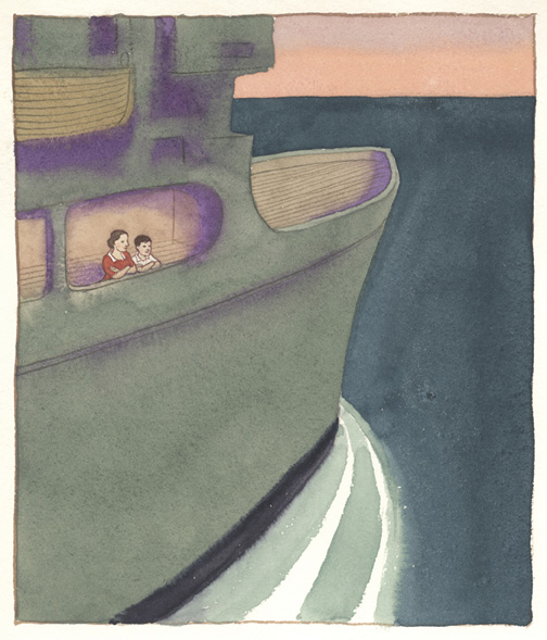
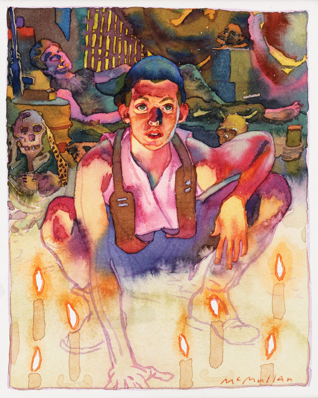
On the USS Breckenridge. Illustration from James McMullan’s Leaving China. Courtesy of James McMullan.
The PushPin experience, in that I wasn’t a close fit to the witty, patterned work that was attracting an international audience at that time, helped me to see who I was and to believe in my own attitude and talent. It was a rich and particularly lucky thing to have happened to me at that point in my life.
D.B. - How hard was it to remain true to yourself in pursuing illustration/realism in an era that had largely turned its back on any representational art?
J.M. - I had always wanted to represent things realistically and to be an illustrator. In art school, I became more sophisticated in noticing what was going on around me in the world of art so I became aware that realism was out of fashion and that illustration was seen as part of the regressive world. However, I could never believe that artists like De Kooning or Franz Kline were as great as the artists I loved: Schiele, Beckmann, Morandi, Picasso or Matisse. Even if the illustrators of the golden age like Rockwell were not expressing the angst of the post-war years, their work contained satisfying expressions of more ordinary but still worthwhile sentiments. And, like all ambitious illustrators, they expressed more than they themselves realized about their own psychology. Also, as we moved into the 1960s and 1970s it became possible to leave boy-girl glamour illustration behind and to begin to include darker and more interesting ideas into our illustration.
D.B. - I have been studying your children’s book Leaving China1. It is an atypical children’s book and goes far above and beyond any bedtime story. It reveals to the reader the pain of transitions, the stress of cross-cultural dynamics, it leads us through loss on many levels and confronts pain directly. Through it all, your gift as an illustrator appears to be your saving grace of self-esteem and all the suffering you endured. It appears to be reflected in your style of illustration. Your work holds an enduring emotional warmth. I think your use of watercolors melting into the work helps to achieve this effect. Do you think your style was developed out of a need for you to comfort yourself, as if your gift were embracing you through your style of image representation? Psychologically speaking, do you believe your style represents the embraces you rarely received from your father and others as a boy?
J.M. - What you have seen, I think, is that both the writing and, particularly, the art, came out of a lifetime of reflection and healing. I was able to celebrate, finally, that I had transcended, through my art, the feelings of inadequacy that had wormed their way through my childhood and into my life as a young man. And I used the story to find a style which was very internal and authentic to my feelings.
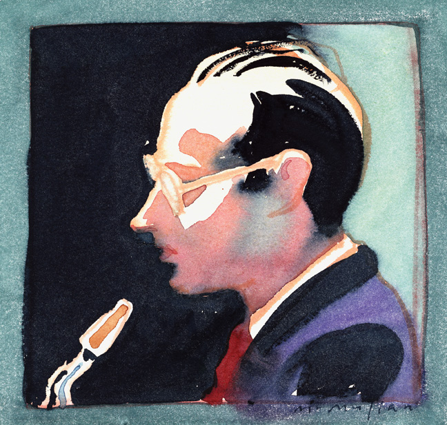
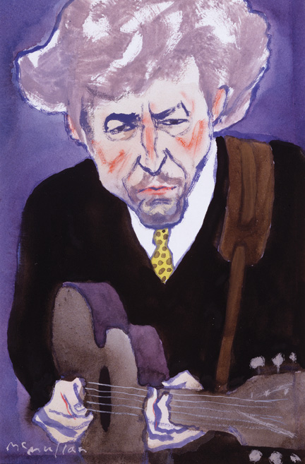
Paul Desmond portrait. James McMullan’s album artwork for Late Lament by Paul Desmond (1990 Bluebird RCA). Courtesy of James McMullan.
Perhaps my choice of watercolor, beyond suiting my inclination towards working spontaneously, was also a “weak” medium (used by Sunday painters to make pictures with delicate colors) that I was unconsciously using to make strong work, in the same way, that the perception of my personality as too understated and effete became part of my conceptual arsenal to make my work significant.
These thoughts about my style are not as poetic as yours but they point in the same direction.
D.B. - Upon studying your art there is a repeated form of a patterned approach to beauty, would you agree?
J.M. - Beauty is such a complicated quality to pin down. I can stand before Beckman’s triptych, Departure, and find the color and the interlocking shapes breathtakingly beautiful, but find myself unmoved by the same kind of color and interlocking shapes in Kirchner’s Street, Berlin. That’s not much of an explanation of what I find beautiful, other than it’s a quality that’s mixed up with content, the intent of the artist, and how all those separate elements cohere.
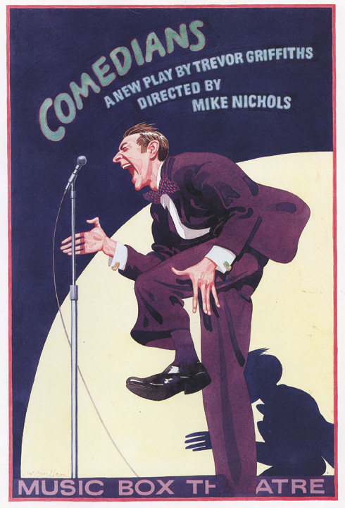
James McMullan’s poster design for Music Box Theatre’s 1976 production of Comedians. Courtesy of James McMullan.
At a recent exhibit at the Met Breuer, there was an interesting side-by-side hanging of a large seascape by Winslow Homer and three smaller seascapes by Marsden Hartley.
In all of the paintings, there were huge white waves breaking against the rocks and surging up to the top of the canvas. In the Homer, the waves felt like a bravura performance of paint handling but in the Hartley, the waves seemed to carry some other much more elemental and psychological energy. To me, the Hartley paintings were more moving and beautiful.
In my own work the only pattern of “beauty” is probably that the drawing and the painting can sometimes reach an intensity of energy and that the color can seem uniquely right for that particular painting.
D.B. - With your rich history of having grandparents that were esteemed missionaries to China how have you chosen to adopt or embrace such a massive humanitarian genealogy? How has this relationship to your history informed you and your work?
J.M. - My generosity to the world expresses itself mostly in my teaching in which I try to be truly helpful and honest and to temper the egocentric possibility of relating to students. I am not a believer in religion but I am of charity and community, even if I am not very good at reaching out, except as a teacher.
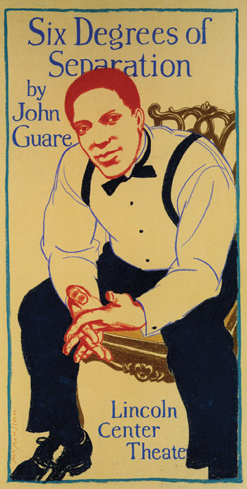
James McMullan’s poster design for Lincoln Center Theater’s 1990 production of Six Degrees of Separation. Courtesy of James McMullan.
D.B. - You have produced 89 posters for Lincoln Center. Does the theater play an important aspect in your interest and life? How so or not?
J.M. - Even after 89 posters for LCT, I have not really become a theater buff - certainly more than I once was - but not that hard core kind of attendee that you might have expected given my career. I have no explanation.
D.B. - You have close ties with many renowned artists. Are there any that have motivated you and helped to act as guides to your career?
J.M. - My experience at PushPin Studio and my long, close bond with Milton Glaser has been one of the strongest relationships of my career and has influenced me in both giving me a model of beautiful design and intelligent problem solving, and also showing me the ways in which my natural inclinations differed from the Style of PushPin.
Another early influence on me was Robert Weaver and his work. The directness of his observations in the world and his way of combining his extraordinarily powerful drawing with an amazing and quirky design sense inspired my attempts to be more forceful in my drawing and more inventive in my compositions. My friendship with Edward Sorel has been a great pleasure and a chance to share an interest in the way writing and politics interact in art. The fact that Ed and I are so different is part of the attraction.
D.B. - Robert Weaver was one of the fathers of visual journalism through illustration. His usage of the collage approach of an image within an image was brilliant. He made political statements in a manner that I never saw before. I remember the drawings of the Chicago riots as a good example. Your work does the same in many ways. You use type as a subject within your posters as a form of visual anchor and stage. Wouldn’t you agree?
J.M. - Yes, in South Pacific, for instance, making the type large and architecturally fitted into the top of the poster balanced and anchored the relatively complicated bottom half.
In another example, the lettering in A Fair Country fits into the art so it both balances the composition and becomes, in its gestural immediacy, an integral part of the art. That calligraphic, almost conversational, aspect of my hand lettering is often a part of my approach. This idea that all drawing potentially sets up strong graphic design possibilities is something that Weaver has inspired me to do.
D.B. - My mind often defaults to one single work of yours. It reflects innocence and holds ambiguity tightly, depicting joy and fear at once. The image is from one of your watercolors from your book, Leaving China. The title is On the USS Breckenridge. The painting keeps defaulting in my mind’s eye to the painting Monk by the Sea by Caspar David Friedrich. The vast space of your watercolor holds fear of the unknown and beauty at the same time. It is innocent in its depiction by presenting elegant graphic lines with no other figures but of you and your mother. Its strength is in its simplicity, just like Friedrich’s work. I believe it takes decades to get to this innocent place of visualization. Have I overread this work?
J.M. - I think Leaving China contains my most intuitive work in which deep emotions-feelings of survival, longing for connection, and melancholy-surface in the art almost without my controlling it. Paradoxically, these difficult feelings also fuel the greatest pleasure in making the art satisfying and beautiful to myself. But you are right, the Breckenridge painting contains the most succinct expression of the impulses that provoked the book in the first place.
D.B. - As young artists, we all had struggles of some kind. Did early pressures to succeed come hard to you?
J.M. - Perhaps because I have always sensed I am making the best of what I have been given to work with and have not been unduly influenced by pressures to take a different path, I have not ended up with much regret. Maybe twelve years of therapy helped and several points of great luck along the way. Even the isolation and bullying of my childhood became the resonance in my art that might have been merely elegant or competent without it.
My advice to young artists and illustrators is to realize that, no matter how many stylistic manipulations they make, the real world of people, things and nature is the mother-lode to all their inventions and a reminder that there is always more to see and to think about in that vast repository.
NOTES
1. James McMullan. Leaving China: An Artists Paints His World War II Childhood. Chapel Hill, North Carolina: Algonquin Young Readers, 2014.
Daniel Bonnell is an artist, writer, and educator, as well as the author of the book Shadow Lessons. The text chronicles an artist’s unexpected journey into an inner-city, at-risk, high school culture. He has exhibited his art in a variety of venues, including St. Paul’s Cathedral in London, St. George’s Cathedral in Jerusalem, Washington National Cathedral in Washington, D.C., and the Cathedral of St. John the Divine in New York City. His eclectic studio instructors included painter Ed Ross, photographer Ansel Adams, and designer Milton Glaser.
















Leave a Reply
You must be logged in to post a comment.