« Features
Fighting with Scale. The Battle for Attention at the Whitney Biennial
Like the Lone Biker of the Apocalypse in the Coen brothers’ film Raising Arizona, the first Whitney Biennial in the spacious, Renzo Piano-designed building, while impressive, is hard on the little things. Small-scale works like Matt Browning’s collapsible wood grids and Ulrike Müller’s modest, enamel paintings and works on paper are overwhelmed by the airy new galleries. Rightfully, much praise has been given to curators Christopher Y. Lew and Mia Locks for the restraint they showed by selecting just 63 artists and collectives, in contrast to the 103 crammed into the overstuffed 2014 Biennial (the last held in the original, Marcel Breuer structure). Lew and Locks take great advantage of the museum’s high ceilings and expansive floors, especially for the site-specific and installation projects. Taken as a whole, the exhibition is a striking curatorial achievement, but the vast space and avalanche of debate over just a couple of controversial works made starkly visible that scale may be the most significant issue in the presentation of contemporary art today.
The Whitney had the stated goal of recommitting this Biennial to presenting a diverse range of emerging American artists, and the curators delivered.1 While more than half come from New York, Brooklyn and Los Angeles, the rest are drawn from across the country and Puerto Rico, with a surprising number, like Browning, living in the Pacific Northwest. Most were born in the 1970s and ‘80s, but many older artists and a few younger ones are also included. About half are women, and African-American, Latino and Asian artists are well represented.
Most were allowed to show multiple works (in some cases, more than a dozen), essentially creating mini solo exhibitions within divided spaces on the main floors of the exhibition along with a few installed on the entrance level, the outdoor galleries and off site. This works well for the collaborative duo KAYA (painter Kerstin Brätsch and sculptor Debo Eilers), whose massive, torqued panels made of mixed media (collectively and ironically titled SERENE, 2017) dominate the entrance to the sixth floor. Many unrelated individual artists are displayed in thoughtful pairings. For example, John Divola’s photographs of abandoned student paintings hung in deserted Southern California buildings resonate in proximity to Leigh Ledare’s projected film capturing social interactions in Moscow train stations (Vokzal, 2016). Less convincing are the divergent combinations, in terms of both medium and content. Carrie Moyer’s abstract acrylic and glitter paintings seem merely decorative in relation to Tuan Nguyen’s timely, high-definition video that documents the remaining evidence of the displaced Vietnamese who were repatriated in 1991 after living on a Malaysian island for more than a decade.
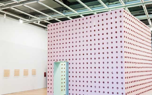
Installation view of Pope.L aka William Pope.L, Claim (Whitney Version), 2017. Whitney Biennial 2017, Whitney Museum of American Art, New York, (March 17-June 11, 2017). Collection of the artist. Courtesy Mitchell-Innes & Nash, New York. Photo: Matthew Carasella. With view at left of Matt Browning, Untitled, 2016, wood, collapsed: 3 ½” x 3 ½” x 18 ¼.”; expanded: 17 ¾” x 17 ¾” x 4.” Collection of the artist.
In terms of size, most impressive for immediate impact are the large-scale installations that take advantage of the new building’s generous attributes. Raúl De Nieves’ faux stained-glass mural covers the window wall at the end of one floor, providing an enlivened backdrop for his beaded costumes and sculptural shoes with their celebratory “hot mess” aesthetic and multi-layered iconographies. At the opposite end of the aesthetic spectrum, Larry Bell’s row of large minimalist boxes, Pacific Red II (2017), has a stately presence on the gray exterior deck overlooking the High Line. The subtle transition of ruby color across the doubled, nested walls of laminated glass by this pioneer of the California Light and Space movement makes a surprisingly suitable visual partner for New Orleans-resident Zarouhie Abdalian’s multi-channel sound installation, Chanson du ricochet (2017), heard overhead.
Samara Golden constructed a fascinating, multi-floored interior placed on either side of the real windows on the museum’s Hudson River façade. Like the convoluted stairways in a drawing by M.C. Escher, Golden’s installation, The Meat Grinder’s Iron Clothes (2017), presents a disorienting view into several floors of a building with arrays of furniture built at two-thirds scale. Each room is doubled, with another installed upside down on the ceiling and only visible as a righted space in the strategically placed mirrors. Like levels in a bland, commercial high-rise, the endlessly reflected and unoccupied interiors of a restaurant, beauty parlor, apartment, gym and office seem to summarize the institutional lifespan of a city dweller. The affective and unsettling array called to mind Jean Baudrillard’s famous characterization of “the real’s hallucinatory resemblance to itself,” as Golden’s artificial set was barely distinguishable from the views of the actual city beyond the window.

Installation view of Samara Golden, The Meat Grinder's Iron Clothes, 2017. Whitney Biennial 2017, Whitney Museum of American Art, New York, (March 17-June 11, 2017). Photo: Matthew Carasella.
Despite all of Lew’s and Locks’ care in selection and installation, it seems this Biennial will be primarily remembered for the debate about a couple of works that has overwhelmed everything else. As has been widely reported, Dana Schutz’s painting Open Casket (2016) was immediately challenged by protestors who stood in front of it to block viewers’ access along with a call to remove and destroy it.2 At issue is the appropriation by this white painter of the photo of the lynched-body of the black boy, Emmett Till, taken at his open-casket funeral held in Mississippi in 1955. Schutz presents a closely cropped and abstracted overhead view that uses the visceral quality of oil paint and a projecting surface to draw attention to Till’s mutilated face. Not quite as intense is the conversation about Jordan Wolfson’s virtual reality piece Real Violence (2017), that also addresses issues of race. It has the potential to be so disturbing that the museum provides multiple warnings before queued-up viewers are handed a virtual-reality headset and cautioned to hold on to a railing for stability while they experience a visceral scene of one white man bashing in the head of another on a city street.
These are hardly the only politically charged or violently themed works in the exhibit. Henry Taylor’s paintings, including The Times They Ain’t A Changing Fast Enough! (2017), depicting the shooting of Philando Castile by a police office in his car that was livestreamed by his girlfriend are interspersed with Deana Lawson’s seductive photographs of African-American daily life focused on hands and the importance of touch. Though easy to overlook due to their diminutive size, the many disabled gun triggers, such as Trigger (Glock 22) (permanently disabled by Chip Flynn) (2017) by the anonymous artist operating as Puppies Puppies, displayed throughout the exhibit also acknowledge the epidemic of gun violence in this country and the futility of individual efforts to curb it.
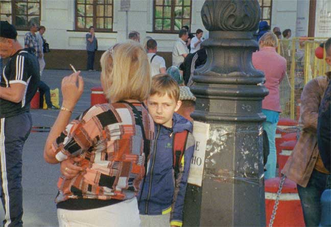
Leigh Ledare, Vokzal, 2016, 16mm film, color, sound; 58 min. Collection of The Art Institute of Chicago, Restricted gift of the David C. and Sarajean Ruttenberg Arts Foundation.
Channeling Hans Haacke’s famously censored example of institutional critique at the Guggenheim Museum back in 1971 (Shapolsky et al. Manhattan Real Estate Holdings, a Real-Time Social System, as of May 1, 1971), a number of projects use a similar conceptual framework to expose financial realities operating behind the scenes in the art world. The collective, Occupy Museums (formed in the wake of the Occupy Wall Street movement), is given prominent placement. For their piece, Debtfair (2017), dry wall was removed and members’ small-scale works are set between the exposed studs. An adjacent interactive website provides the stories of individual member’s crippling art school debt in contrast with the low earning potential for most professional artists.
Ever since the shock of the politically charged, identity-oriented 1993 Biennial, there has been the expectation by some that Whitney curators are obligated to make these kind of selections that reflect the social climate of the country over any other topic or aesthetic concern. This year’s curators take a more balanced approach. Though artists for this survey were selected before the November presidential election, Donald Trump is referenced in a couple of works along with issues that have gained traction since his move into the White House. For example, his name appears in Celeste Dupuy-Spencer’s drawing Trump Rally (And some of them I assume are good people) (2016), and Postcommodity’s four-channel video installation, A Very Long Line (2016), makes palpable the experience of undocumented immigrants blocked by endless fences on the Mexican border, reminding viewers of Trump’s pledge to build a wall there.3
Care seems to have been taken in the layout of the show to provide zones of respite after viewing the most challenging work. For example, jazz musician Kamasi Washington’s composition Harmony of Difference (2017) plays in a dimly lit blue room offering seating for visitors to take a break immediately following Schutz’s painting. And Asad Raza’s 26 individually potted trees are arrayed in a carpeted zone coming just after Wolfson’s harrowing piece. Titled Root sequence. Mother tongue (2017), Raza’s arrangement soothes the viewer with wafting customized scents, dappled UV lighting and the presence of the trees’ “caretakers” and their personal possessions.
Despite these efforts, the exhibition is dominated by the most strident work. The scale of the largest, loudest, smelliest, most preachy pieces bullies the smaller-scale and intimate work, and that’s a shame, because there is much to enjoy in the more detail-oriented and crafted projects. For example, Browning’s unpainted, 18-inch-square interlocking rectangles hand carved out of a single block of wood are lost along a stretch of wall in the shadow of Pope.L, aka William Pope.L’s giant, pink structure Claim (Whitney Version) (2017). Here, real slices of bologna schmeared with tiny, black-and-white portrait photos are pinned in a grid to the structure’s walls, both inside and out. The number of portraits is purportedly representative of the size of the Jewish population in New York City, but that “fact” and the artist’s supposed challenge to knowledge is lost in the experience of the rotting sandwich meat and degrading images.
KAYA’s floor-to-ceiling panels of industrial materials, LED lights and aluminum hand bars demand viewers’ attention to the detriment of Jessi Reaves’ nearby, wall-mounted constructions and furniture sculptures. Her great Modified Wall Shelf with Racing Purse (2017) can only be appreciated by getting close to observe this kooky mash up of plywood, bamboo, sawdust and batting with a checkered vinyl purse thrown in just for fun. Her equally enjoyable, and functional, sofas and chairs are interspersed throughout the exhibit (there’s a lot of furniture in this show). Their assorted, tactile materials and intentionally unrefined craftsmanship are easy to overlook in the galleries but offer a welcome diversion for those who notice them.
Similar pleasure is available in a number of artists’ work that relies on careful attention, but only once you get past the more bombastic efforts. An-My Lê’s inkjet-printed photos (from the series The Silent General, 2015-17) were shot in Louisiana using a 5-by-7-inch view camera to capture incredible detail. Views of a Confederate general’s monument, a burning sugar cane field and a battle scene being shot for a Civil War film reward lengthy examination. Beyond the strength of the individual compositions, the images reflect on larger themes of war, race and America’s history of slavery, nostalgia and place.
Instead of addressing grand themes, Dupuy-Spencer’s small-scale paintings and drawings depict everyday scenes from a cross-section of American life. Her faux-naïve style complements the mundane subjects. In addition to the folks at the pro-Trump rally, there are guys in a sports bar (that the title tells us used to be a gay bar), a woman dispensing meds at a clinic, a man dressing his baby, teenagers fighting in an alley and well-heeled guests at a swanky art party. Like all of her narrative work, the oil painting Fall with Me for a Million Days (My sweet waterfall) (2016) depends upon the artist’s keen eye for detail. We are positioned behind a guy engrossed in the process of digitizing his record collection while standing at his bedroom stereo. Dupuy-Spencer celebrates the democratic mix of musicians in the posters on his wall, albums and books acknowledging diverse talents such as Esther Phillips, Nick Cave, Bruce Springsteen and Sam Cooke. The intensity of the young fan hunched over his turntable and laptop resonates with the Jimi Hendrix lyrics quoted in the title. Eschewing the didactic posturing found elsewhere, there is a love and acceptance for the artist’s subjects here that feels genuine and inclusive.
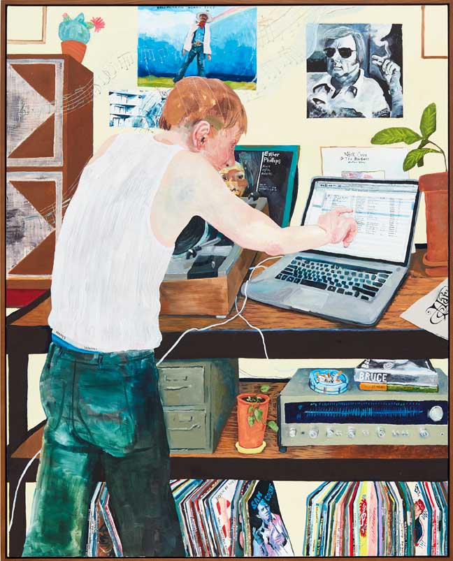
Celeste Dupuy-Spencer, Fall with Me for a Million Days (My Sweet Waterfall), 2016, oil on canvas, 60” x 48.” Private collection. Courtesy of the artist and Mier Gallery, Los Angeles.
So what do we learn from the disparate approaches to scale in this Biennial? Piano’s design for the Whitney’s new building follows in the trend of current museum architecture that responds to the need to display contemporary art that is often large-scale and space intensive. But this group exhibition made plain the problem for small-sized or less spectacular work in these vast culture halls. One thinks of MoMA’s early installations of collection work in Yoshio Taniguchi’s addition (completed in 2004). Monet’s mural-sized Water Lilies and the grand canvases of the Abstract Expressionists-designed to overwhelm in a conventionally scaled, mid-century exhibition space-looked like postage stamps at the bottom of the multistoried atrium. Mercifully, Lew and Locks didn’t repeat the uncomfortable install of the 2014 Biennial, where smaller work was often hung salon style in cramped rooms, making it impossible to gain perspective on anything. It is very clear that they were mindful of the need to give individual works appropriate space as much as was possible. There are just a few sad examples of artists who are marginalized due to the diminutive scale of their work (like Müller’s quietly beautiful abstractions that went overlooked down a side hallway).
The curators have been equally sensitive in their response to the over-scaled controversies that they couldn’t necessarily have anticipated. The Whitney is standing firm in its continued display of Schutz’s Open Casket. Shortly after Hannah Black’s call to remove and destroy it, the curators issued an unequivocal justification for the work’s inclusion in their show. In a particularly thoughtful analysis of this debate, artist Coco Fusco suggested that it is Schutz’s abstract approach to rendering Till’s body that contributed to the outrage.4 She points out that similarly difficult figurative subjects included here and elsewhere in art history got a pass when treated more realistically. Whether or not this is a convincing argument, it offered a fresh way to consider the contrast between the many examples of abstract and figurative painting included in this exhibit.
As a kind of summary of the issue of scale in this Biennial, it is instructive to consider another painting by Schutz. Elevator (2017) was commissioned by the curators and is prominently displayed at one of the entrances, immediately visible when stepping off the real elevator. More than three times the size of Open Casket, the equally abstract canvas presents a diverse group of people jammed in an elevator with the metal doors open to either side. While some poor worker attempts to hang wallpaper at the back left, viewers fight with one another for position and perhaps access to the megaphone included at the lower right to broadcast their opinions. One assumes the curators thought the painting would announce their exhibition theme of bringing to light the “many facets of the human experience.”5 However, its size and congested composition are not convincing and seem cartoonish. Much more persuasive are the quieter, smaller-scale paintings by Dupuy-Spencer or Aliza Nisenbaum in which the artist seems to have forged a genuine bond with her very specific subjects instead of treating identity as an abstract category. If any general conclusion can be drawn, it is that the 2017 Whitney Biennial proves, once again, that size really does matter.
Notes
1. Scott Rothkopf, “Sincerely Yours: A Conversation with Christopher Y. Lew and Mia Locks,” in Whitney Biennial 2017, exhibition catalog (New York: Whitney Museum of American Art, 2017), 17.
2. For details on these events, see Lorena Muñoz-Alonso, “Dana Schutz’s Painting of Emmett Till at Whitney Biennial Sparks Protest,” artnet news (March 21, 2017), https://news.artnet.com/art-world/dana-schutz-painting-emmett-till-whitney-biennial-protest-897929?utm_campaign=artnetnews&utm_source=032117daily&utm_medium=email&utm_content=from_&utm_term=artnet%20News%20Daily%20Newsletter%20USE.
3. The interdisciplinary collective Postcommodity was founded in 2007 by Raven Chacon, Cristóbal Martínez and Kade L. Twist.
4. Coco Fusco, “Censorship, Not the Painting, Must Go: On Dana Schutz’s Image of Emmett Till,” Hyperallergic (March 27, 2017), https://hyperallergic.com/368290/censorship-not-the-painting-must-go-on-dana-schutzs-image-of-emmett-till/?utm_source=sumome&utm_medium=facebook&utm_campaign=sumome_share.
5. See Christopher Y. Lew’s and Mia Locks’ statement reprinted in Muñoz-Alonso, “Dana Schutz’s Painting of Emmett Till at Whitney Biennial Sparks Protest,” referenced in note 2.
Kristina Olson is associate director of the School of Art & Design at West Virginia University. Her texts have been published in Art Papers, Art in America, Sculpture Magazine and the former New Art Examiner. She was a contributor to Kartoon Kings: The Graphic Work of Simon Grennan and Christopher Sperandio (2007) and co-editor of Blanche Lazzell: The Life and Work of an American Modernist (2004), both published by West Virginia University Press. She is currently exhibition reviews editor for the Southeastern College Art Conference Review.













Leave a Reply
You must be logged in to post a comment.