« Features
In Defense of Menacing Content. A Conversation with Derek G. Larson
 On first glance, the saccharine pop imagery, neon colors and DIY aesthetic of Derek Larson’s mixed-media works seem one more contribution to our instant culture. (The giant, freestanding screen with projected animation that he constructed for the PRAVA festival in Washington, D.C., in 2015, for example, became a crowd favorite as a selfie backdrop.) But that superficial reading glosses over the considered mash-up of contemporary and historical references that Larson engages to address issues of wealth, youth and time and his careful compositional sensibility that reaches back equally to everything from mid-century modernism to dated video-game imagery.
Larson received his MFA from the Yale School of Art and is currently working in Statesboro, Ga. He was a finalist for the Hudgens Prize in 2014 and teaches in the summer program at Virginia Commonwealth University. The artist has an upcoming residency at the Arteles Creative Residency Program in Finland and is represented by the ADA Gallery in Richmond.
BY KRISTINA OLSON
Kristina Olson ─ You’ve stated that you are ‘interested in making original objects with infinitely reproducible media.’ This sounds like a compelling contradiction. Can you begin by discussing this relationship between your projected animations that incorporate appropriated material and the individually crafted, sculptural screens in such works as The Forbes 400 or The Soros & Dalio, both from 2015?
Derek Larson - About five years ago I started making large metal screens for shaped/projected animations. They’re freestanding GIF sculptures, and I think their contradictory nature is about some gap or in-between state. As for the appropriative aspect, I’m looking at periods in history, film and TV. The Western canon in art and literature is problematic because it ranks culture, or decides what’s important and what isn’t. By appropriating images and stories, we can retell them to make new ones. What would a new canon look like? Some artists already address this, like Jon Rafman and Bunny Rogers. But, the two pieces you mentioned are mostly about economy and speed. Their titles reference the 2008 banking crisis, and The Soros & Dalio is about hedge funds that have eyes and creepily rub their hands together in a loop.
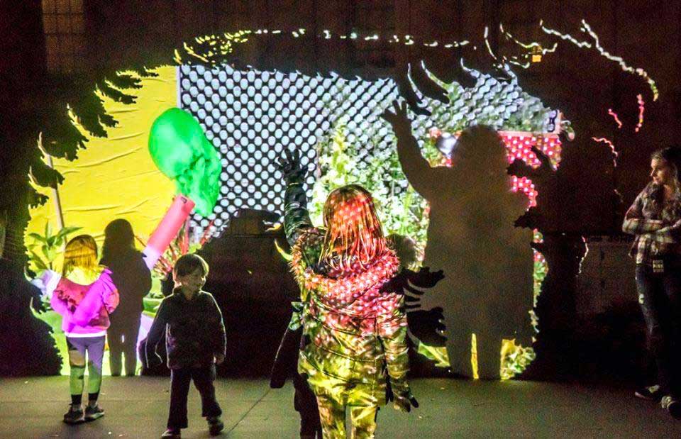
Derek G. Larson, Talking Material, 2015, projected animation on aluminum, wood. Courtesy of the artist.
K.O. ─ That’s a powerful and disturbing image. Even though you work in multiple media (sculpture, video, appropriated objects, lights, sound, etc.) you seem to approach everything with a painter’s sensibility. Is that a fair characterization, and what were your foundational experiences that fostered that sensibility?
D.L. ─ Yes, I was a painter until I met Jessica Stockholder at Yale Norfolk. Her critiques are very idiosyncratic and an art form in itself. I connected with her approach to sculpture and later got my MFA at Yale working in video and installation. I still think like a painter even though most of what I make isn’t necessarily painting.
K.O. ─ And now you are making music, too, under the pseudonym ‘Sherbet Marcuse.’ You’ve said that this is a less serious outlet separate from your artistic practice. Have you considered integrating the two?
D.L. ─ Yes, but it hasn’t happened yet. Making music in the studio can free up any mental blocks, and Sherbet Marcuse is a project that uses lyrics written by Dolly Parton, allowing me to make music faster. The name ‘Sherbet Marcuse’ is an obvious reference to Herbert Marcuse and specifically his book One-Dimensional Man (1964) about capitalism and the working class (also related to Dolly Parton’s lyrics.) She wrote beautifully direct tragedies similar to Marcuse’s virtues of negative thinking.
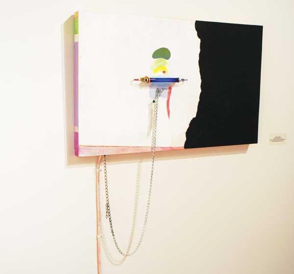
Derek G. Larson, Fabergé Egg, 2013/16, acrylic, black light, metal, fabric, wood panel. Courtesy of the artist.
K.O. - That description to your approach to making music seems so aligned with your visual work where you make these formal and conceptual comparisons across periods and discourses, eliding any hierarchical distinction. Lately, you’ve been doing your own research into the psychology of color and have even produced a self-published book analyzing your preliminary results.1 How does that research inform your work?
D.L. ─ This project is a year old and is definitely in the back of my mind when I’m in the studio. Composition, Color & Interactivity is a study in eye-tracking, color interaction and emotion-correlated design. This winter, I’ll work on a long-form publication in Finland, looking for Scandinavian and Russian design archives, and then later I’ll visit the Josef and Anni Albers Foundation archives in the spring.
K.O. - What about the formal rigor in your work? On first glance, pieces look very contemporary, with glimpses of video games and screen savers, but you are also candid about your interest in the color theory of a high modernist like Josef Albers or mid-century Color Field painter Morris Louis. Your exhibit “Saf Aleph” (2015) borrowed the title from a Louis painting and alludes to his poured veils of thinned paint throughout.
D.L. ─ I’m not a formalist, but the languages of modernism, math and utopia are perfect for analytical thinking. I’m a huge fan of Morris Louis and Helen Frankenthaler, and they marked a radical time approaching painting as directly as they could. By removing brushes, hands and expression they opened an opportunity for conceptual art.

Derek G. Larson, Wormwood Tea at exhibition “Saf Aleph,” 2014, Mulherin + Pollard, New York, NY. Courtesy of the artist.
K.O. - Let’s turn from these more formal elements of your work to the conceptual. In the catalogue essay for her recent exhibition “Forever Now” at the Museum of Modern Art, curator Laura Hoptman made the case that artists like Charline von Heyl, Laura Owens and Michael Williams are making atemporal paintings in the age of the Internet. Like you, these artists borrow from a range of sources, including art history and pop culture. She says their work is paradoxical because even though it may contain elements of history, it isn’t historical; it is innovative but not novel. Do you feel like you’re working in this atemporal vein?
D.L. ─ Somewhat, but I think the “Forever Now” show was more historical than anything. A few of those paintings looked like they could have been from the original 1958 show. Laura Owens’ paintings were very good and met the challenge in the essay, and there are many artists making similarly relevant work, like Dora Budor, Hito Steyerl, Anicka Yi, etc.
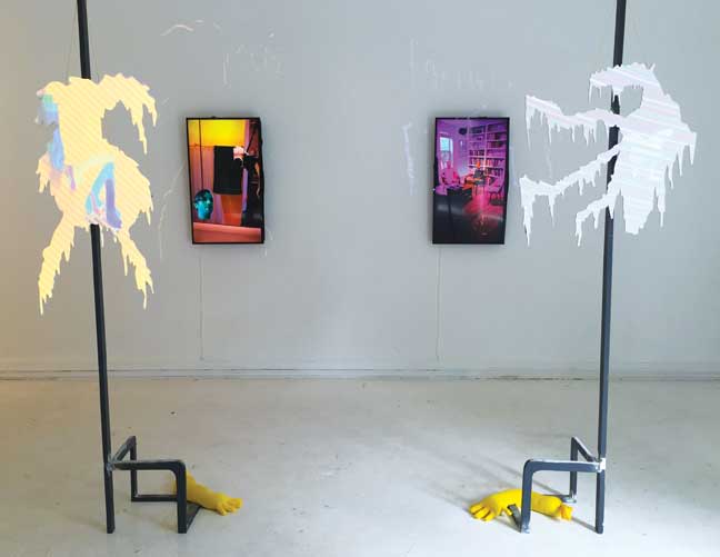
Derek G. Larson, installation view of “Psychic Phones,” 2016, ADA Gallery, Richmond, VA. Courtesy of the artist.
K.O. - A number of critics are addressing the culture of cuteness that is so pervasive in the art world right now.2 Your work moves from the advanced psychological and philosophical material with which you are engaged (like the title of your recent exhibit at West Virginia University, “Ever-Pre-Given,” taken from a 1971 essay by Louis Althusser and Étienne Balibar) to these cute, banal pop motifs, such as the repeated smiley faces in Summer of Hate, 2015. Is this a reflection of your ‘atemporal’ grazing?
D.L. ─ I think it depends on how the word ‘cute’ is used. If it’s from the perspective of someone labeling another thing or person ‘cute,’ then no. Did you read about the Berlin Biennale? It was an important show that was initially dissed for being too commercial and slick. But what was so good was its menacing content. At first glance it seemed light, but there was heavy oppression buried under layers of commercialism. If you look at something close and long enough you can go weird with it.
K.O. - Do you feel like you are accessing that kind of ‘menacing content?’ If so, in what way? Is it about getting at the depth behind the seemingly superficial or cute?
D.L. ─ Yes, there’s always some kind of menace behind the superficial, but it’s interesting when intention and message don’t match up. I’m trying to use past languages and histories to challenge dominant systems, and it’s hard because there’s so much nuance in language. The English language borrows from French, Latin and Germanic languages and presents its own challenges as a clearly dominant system.
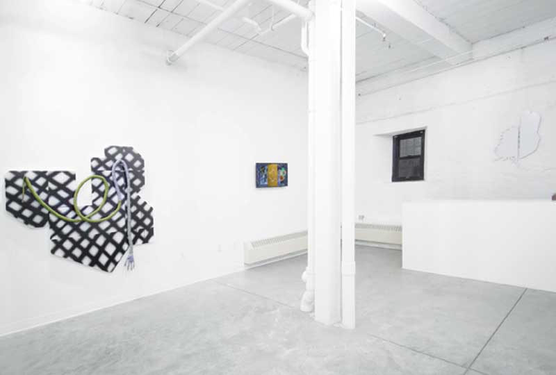
Derek G. Larson and Marc Mitchell, installation view of “Nothing Ritually,” 2016, GRIN Contemporary, Providence, RI. Courtesy of the artists.
K.O. ─ That’s certainly true. Finally, do you want to say something about your presentation for the ADA Gallery booth at Untitled in Miami during last Art Basel?
D.L. ─ Yes, was really excited for Untitled. I have been making a group of paintings with arms reaching out to show videos on phone-like objects. The arms are trying to share moments from another planet. I’m a fan of sci-fi and telling the story of an organization trying to communicate the mistakes and horrors of their home world. But the problem is that they can only communicate using objects and logos. Thousands of years ago their language was alphabetic, but it transitioned into a kind of hieroglyphics only using logos from private companies.
K.O. ─ Thanks, sounds like it is another intriguing mash up for you and very relevant.
Notes
1. Derek G. Larson, Composition, Color & Interactivity (2015).
2. For example, the book The Aesthetics and Affects of Cuteness, edited by Joshua Paul Dale, Joyce Goggin, Julia Leyda, Anthony P. McIntyre and Diane Negra, was published by Routledge in December 2016.
Kristina Olson is associate director of the School of Art & Design at West Virginia University. Her texts have been published in Art Papers, Art in America, Sculpture Magazine and the former New Art Examiner. She was a contributor to Kartoon Kings: The Graphic Work of Simon Grennan and Christopher Sperandio (2007) and co-editor of Blanche Lazzell: The Life and Work of an American Modernist (2004), both published by West Virginia University Press. She is currently exhibition reviews editor for the Southeastern College Art Conference Review.























Leave a Reply
You must be logged in to post a comment.