« Reviews
Jonathan Lasker
Cheim & Read - New York
By Craig Drennen
Jonathan Lasker’s recent solo exhibition at Cheim & Read looks remarkably relevant right now. It’s easy to forget how few painters from the Neo-Geo era survived unscathed into the 21st century without looking dated and overwrought. There’s an even smaller number who’ve gotten continually better over the years. In Lasker’s case, one reason might be that his work never abandoned the inexplicable value of the subjective mark, even if it appeared to be delivered through Microsoft Word. His work also asserted that abstraction could be about something, without reducing itself to the transcribed results of overdetermined data gathering. (Even Jack Goldstein eventually fell prey to the latter.)
The exhibition begins with a series of small, untitled drawings made with graphite and India ink on paper. The grid in each drawing has just enough quaver to announce its homemade status. The grids are overlaid with a limited vocabulary of black marks-thick parallel lines, thinner crisscrossing lines and knots of thin squiggles-each demonstrating its capacity to act as a subject. The drawings hit a position halfway between corporate dry-erase boards and vintage punk ‘zines, and perhaps provide a guide to Lasker’s value system: the handmade mark as vernacular, classless and infinitely interesting. The 60-by-80-inch painting Commerce and Darkness seems to be the outcome that the drawings predict. This piece transcribes the formal elements of the drawings into oil paint on linen, with the addition of a pink troweled-on impasto that Lasker has made famous. The title could also be the most succinct description of the contemporary art world you’re likely hear this year.
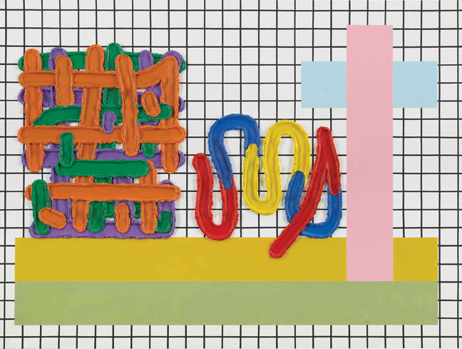
Jonathan Lasker, The Plus Sign at Golgotha, 2014, oil on linen, 60” x 80.” Courtesy of Cheim & Read.
There’s an identically scaled painting in the exhibition that also begins with the grid format. This painting, The Plus Sign at Golgotha, establishes green and yellow horizontal stripes as the ground plane for the picture. Onto these two stripes sit three additional events. On the left is an ad hoc structure made of vertical and horizontal strokes of secondary colors, and a curving line of primary colors anchors the center. But on the right side, emerging from deeper within the ground plane, is the titular “plus sign” made from pink and blue pastels. It may be that as Lasker worked on this piece he noticed that his abstract shapes accidentally resembled the noted Christian cross. (Raphael Rubenstein suggests as much in his thoughtful, free-roaming catalog essay.) The compact, affectless composition, screen-friendly layout and targeted use of synthetic colors makes this painting seem less like Barnett Newman’s Stations of the Cross and more like a SiriusXMTM Station of the Cross. There are other big payoffs in the exhibition, such as The Universal Frame of Reference, which also happens to be the largest piece in the exhibition and shimmers with an entire glossary of Lasker’s pictorial devices sectioned off like a cafeteria tray, bright as emojis. Repetitive Identity is a 12-by-16-inch canvas board piece that’s precious as a miniature in this context. When Lasker introduces his own initials as one of the painting’s three repeated elements, the result is deadpan comic effect.
This bracing and satisfying exhibition underscores the fact that Lasker’s process balances sustained discipline with continued questioning. At this moment in his career, his work appears as a serious, museum-worthy continuation of the legacy of abstraction, while still feeling somehow light and unburdened from that very tradition.
(January 7 - February 13, 2016)
Craig Drennen is an artist based in Atlanta, GA.
Filed Under: Reviews






















Leave a Reply
You must be logged in to post a comment.