« Features
The Psychogeography of Val Britton
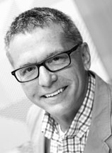 Microclimates of nostalgia and exploration is how I describe the installations of Val Britton. Her complex work is composed of collaged paper forms floating and curving through space like weather patterns guided by gossamer tethers. In our discussion, Val openly comments on the evolution of her work and the relevance of maps as a key component in her artistic endeavors.
By Scott Thorp
Scott Thorp - Back in the 1950s, Guy Debord developed psychogeography to explain how our behavior is affected by local geography. With this line of thinking, our emotions and movements are greatly influenced by our surroundings. The main exploit of this view is the dérive-a journey through space and time entirely in reaction to the landscape presented. Your works consistently reference cartography. I see the mapmaker’s mind in them. Typographical forms are connected with chains of intersecting lines. As lines connect, they often form nodes signifying destinations. But I get more the sense of a dérive-like odyssey than a mapping of space. It’s as though you are taking us somewhere. Can you speak a little about your history with maps and how they serve as inspiration?
Val Britton - I began working with maps in graduate school over a decade ago. While driving across the country from Brooklyn to San Francisco where I was to begin school, I used an atlas to guide my way and to find state parks where I could camp over the two-week journey. This was in the era before GPS and smartphones were part of my life. In addition to being a practical tool, the atlas provided a language I adopted as a way to connect to my father’s story as a long-haul truck driver and mechanic, to make sense of his loss when I was younger, as well as a way to think about my own changing geography and sense of place. I began sketching out sections of his interstate routes, tracing them and using the map networks as scaffolding on which to build larger, more expansive drawings where I could insert my hand and identity. These map-inspired drawings evolved organically, and each took on very a different identity as I used various techniques including drawing, painting, staining, printing, cutting, collaging and stitching the paper. This journey became about time as well as space, a meditative experience of charting time spent with the work and developing a visual vocabulary.
This connection to psychogeography and the dérive is resonant for me. Rather than describing a physical place or prescribing a way of looking, I am applying the map language to my internal, invented landscapes. I am suggesting multiple interpretations and ways of navigating these systems and being open to what the viewer may find. I make these works with a sense of searching and being guided by each move that I make along the way: creating a problem, digging in and then trying to work my way out. Over time, my works have strayed from actual places to become more abstract and almost entirely invented.
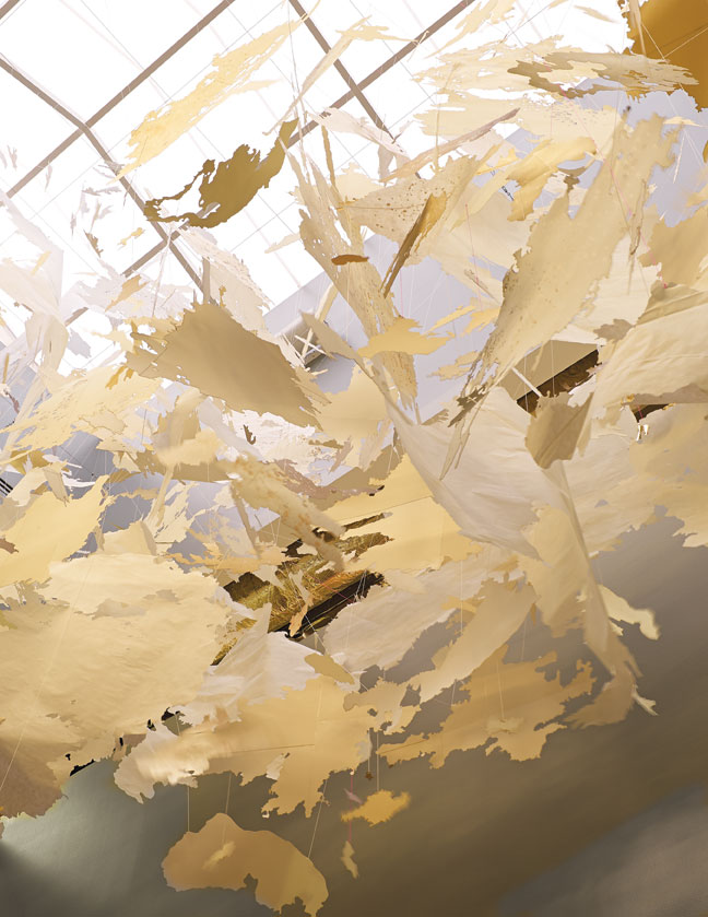
Val Britton, Cascade (detail), 2013, site-specific installation of hand cut and laser cut paper, ink, and thread, approximately 26 x 10 ½ x 25 feet. Commission for Facebook Headquarters, Menlo Park, California.
S.T. - Yes, I get the sense you’ve gone from describing spaces to inventing spaces. That’s where I tend to find your work unique among artists delving into map-like concepts. For instance, Guillermo Kuitca’s imagery is descriptive of places he seems to have dreamed up. While they are nonsensical in some manner, they are precise. Your environments, on the other hand, are more ambiguous and experiential.
Many of your installations are large in scale. The one in the Facebook headquarters at Menlo Park is over two stories tall, yet your materials and methods remain delicate. Often times, intricate slivers of paper combine to establish fragile webs that visually connect the cloudlike paper forms, all being suspended from tiny threads-not what you’d think to use when covering 4,000 to 5,000 cubic feet of densely packed space. Working in this way must cause the initial planning for larger installations to be daunting, if not anxiety ridden. Can you speak about how you approach these kinds of works and what’s going on in your head as they move forward?
V.B. - The installations are site-specific, so each one is designed for a particular space and responds to the architecture of that site. I usually begin by making a rough sketch that determines how I would like the installation to move through the space and what I want the piece’s trajectory to look like. I then create the cut paper elements that will fill that space. I would say the planning is minimal and suggestive, because as I build the pieces by hanging paper elements one by one, the piece takes shape and builds its own momentum from within. And I really love the freedom to build the piece on site spontaneously. Often I respond to what is happening, tweaking and adjusting elements as I go, so the final outcome is not always predictable, even for me. There’s a sweet spot in the middle of the making where the piece almost feels like it is making itself. There’s a certain type of flow that happens, so it’s more exciting rather than daunting.
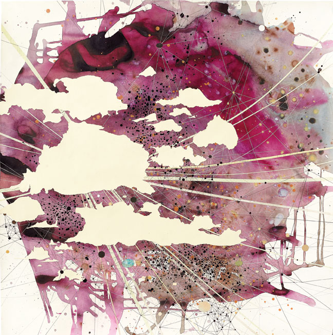
Val Britton, Reverberation #30, 2015, ink and collage on paper, 36” x 36.” Courtesy of the artist and Gallery Wendi Norris, San Francisco.
When I first began working with these installations a few years back, I used very delicate sewing thread because I wanted the hanging support lines to be so fine as to disappear. Yet I discovered I needed many, many lines to stretch and shape the delicate paper in space so it would hold its form, and that these lines were forming a web of connection that was an integral part of the work, a drawing in space. I did not want to hide this aspect but rather to emphasize it, and I began using thicker string, crochet thread and also experimenting with color. The web formed by these lines is still quite delicate, but it is meant to hold its own in the ecosystem of the piece.
Back to your question about fragility, the material choice of paper is important to me. When I first started fooling around with installation, it began as an outgrowth of my collage practice. I was using the paper collage elements from my two-dimensional pieces and playing with them in space. Using paper, a material that I have an intimate knowledge of and comfort with, gave me the confidence to work three dimensionally, which was intimidating to me. I thought about using a more rigid material for the installation, such as plastic, but as I worked with these delicate sheets of paper, crumpling them and torquing them, I was drawn to the sculptural possibilities in manipulating paper. I also felt that this fragility of the material connected emotionally to what I am trying to convey in these works, a feeling of tenuousness, of a tension where one doesn’t know whether the forms are in the process of building up or exploding apart, a humbleness of material and economy of means that when accumulated could become bigger than itself. I’m also very invested in the simplicity of paper and how it can be manipulated by hand in so many ways. I value the aspect of work that is built up over time in layers, that has some sort of larger drama but that also rewards a closer looking with a certain amount of detail. The installations are in a sense collages exploded in space, so they give the viewer a multiplicity of experiences depending on how the viewer approaches the work.
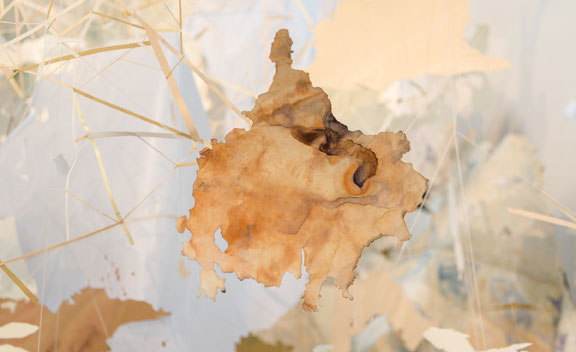
Val Britton, The Continental Interior (detail), 2013, dimensions variable, site-specific mixed media installation of hand cut paper, ink, tempera, and thread. Courtesy of the artist and Gallery Wendi Norris, San Francisco.
I just completed my first installation made of a more durable material, water-jet-cut aluminum, for a corporate building in Houston. Working with a fabricator, I translated paper shapes into cut metal and hand-painted the forms, which were then hung with thin aircraft cables. Throughout the process of working on this piece, I have been thinking about material choices and how this permanent installation had to be metal to exist in the public space where it will live and how to try to preserve the qualities of my paper pieces, the handmade qualities and the delicacy while translating the materials into something entirely new. This piece is probably the largest I have made, and I used a model to work out the appropriate scale for the space so the piece would fit visually without being swallowed up by the space or feeling otherwise out of harmony. The funny thing is that once the metal pieces were coated with a primer and I was ready to paint them, they transformed from being shiny metal to being soft, matte colors, and visually they resembled paper once more, but because they are metal, they held their curved forms on their own without the need of multiple lines. So that web-like hanging element of the installations fell away, and I used only vertical lines to hang the forms, which gave the piece a new visual rhythm and an elegance.
Creating a more permanent, durable installation has brought me to reflect anew on material choices and sensitivity to the delicacy and/or strength that a particular material can embody. I do not think that I have to choose between delicate constructions in favor of durable ones; rather, they each have their own place and time. Experimenting with new materials and responding to the challenges of different sites has opened up additional possibilities and ideas in my practice.
S.T. - It’s interesting how technology creeps into the process. When I look at these, I really get the feeling of handcrafted intimacy. I know the reality of going large is that fragile materials can lead to ephemeral installations. Ironically, the water jet may help you create more detail than you could by hand. In one of your earlier works, Re-Mapping, an installation covering the side of a freestanding wall, sheets of cut paper curve and bend from the vertical surface. They peal from the wall. In this piece, I get the sense of materiality you are describing in your newest work using sheets of metal. In Re-Mapping, the paper sheets retain a certain fluidity but are also rigid in appearance. Plus, they extend as though pulling from the surface. In this sense, they are both revealing areas and hiding others. I’m reminded conceptually of Robert Ryman’s white paintings. I’ve never been able to figure out whether his intent was to paint new surfaces or to cover over old ones.
Working as you do is interesting in how it can be used to hide information as much as it divulges. As a kid, I’d make maps of places where I had hidden stuff. They were more about retaining secrets than tools for discovery. As you move through this process of making, is there any sense of covering up or leaving behind things as you move forward? If so, could you describe that?
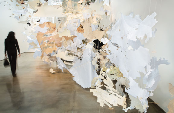
Val Britton, The Continental Interior, 2013, dimensions variable, site-specific mixed media installation of hand cut paper, ink, tempera, and thread. Courtesy of the artist and Gallery Wendi Norris, San Francisco.
V.B. - Yes, the technology has crept in in helpful ways. I had the chance to use a laser cutter for the first time with the Facebook installation and have used it several times for subsequent installations. I think about my use of technology carefully. I am able to use my own drawings with the laser and to manipulate them in new, exciting ways. The technology also imparts unique characteristics to the paper, such as singeing or a carving/beveling edge quality that are different than what can be achieved by hand. I try to be sensitive to using the right tool for the appropriate application because I don’t believe that quickly producing multiples is what I want for my projects. Sometimes I think that in trying to speed up and focus on productivity we lose stinking space. So I think a lot about protecting slowness and my space to think. Rather, I’m interested in the mutations and new forms that can be created by marrying my handmade practice with technology.
In much of the work, such as Re-mapping, there is a balance between discovery and concealment; but rather than trying to hide information, I’m trying to edit the information in order to find clarity. Collage involves the layering of surfaces, so one layer is always being covered by another subsequent layer. In some ways I feel like something is always being lost. I often use the placement of collage pieces to create negative spaces within my composition, to navigate moments of calm amid all the paint. My two-dimensional works involve the figure-ground relationship of sorts, but there can be so much layering that there are multiple figures and multiple grounds and the surfaces become entangled. What is being revealed is not clear, and I am most interested in that tension between zones and those shifting perspectives.
With Ryman, I admire his seemingly endless experimentation with so many different substrates and mark making/painting materials. I feel like rather than revealing versus concealing, with his work I think about how the paint meets the substrate and what space is being created in the interaction of that collision of materials.
S.T. - I like your description of Ryman’s pursuit. And I totally agree that his goal was more process than product. Something I keep noticing, especially in the domain of installation art, is how closely linked art and design are becoming. Design is creeping into all aspects of businesses. And subsequently, commercial spaces are regularly designed around artistic experiences. Designers and artists seem comfortable jumping back and forth from fine-art spaces to commercial ones fairly seamlessly. The graphic designer Stefan Sagmeister’s “Happy Show” at Institute of Contemporary Art is an example. And Ernesto Neto’s relationship with Nike takes him back and forth from art to design.
In my mind, viewers still see commercial and artistic spaces differently. Works in art institutions like MOMA or the Whitney tend to retain a certain respect and contemplative gravitas, while those equally artistic ones in retail areas get tagged as amazing or awesome in social media. In some ways, I think the art fairs such as Art Basel are associated with this. As your work receives more recognition and your corporate clientele grows, are you experiencing a tug toward more designed-minded spaces? If so, what are your feelings about that, and what do you think about the closing gap between art and design?
V.B. - We’re living in an interesting age where artists are often wearing more than one hat. I can see how the line between art and design is blurry and I don’t think it’s a bad thing. In my opinion, design projects are ones in which the artist is given the design problem or brief and must create work to fulfill a client’s needs, rather than projects that allow an artist to exercise their creative freedom purely for the sake of their need for personal expression.
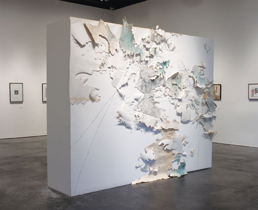
Val Britton, Re-mapping, 2006, installation with printed paper cut-outs and acrylic on wall, dimensions variable. Courtesy of the artist and Gallery Wendi Norris, San Francisco.
When thinking about different venues such as a corporate commission, retail display or museum show, for me what separates a work of art from a design experience is the level of agency and artistic freedom that the artist has in the project. It’s different to invite an artist to do what they do, to make work that is integral and authentic to their already existing artistic practice, to have free reign in the space such as in a museum as opposed to asking an artist to adapt or modify their practice significantly to suit the architecture, bend in response to prevailing trends or to the art direction of the client. The Ernesto Neto Nike project is kind of tricky because the work he produced there looks entirely in line with his other installations for museums. Perhaps it was just a smart pairing: Nike wants to sell shoes and Ernesto Neto happens to make work that embodies characteristics they are trying to promote with their shoe technology, so perhaps it was a win-win for both of them. Maybe it comes down to the artist’s intent. Maybe it doesn’t matter!
Large corporations, particularly in tech such as Google or Facebook, are becoming the Medicis of our day, commissioning work for their campuses and in effect becoming major art patrons. Artists need opportunities and patronage, and this is the modern-day equivalent. However, I believe that artists need to be sensitive to pursuing projects that challenge them and advance the growth of their artistic practices and to passing on projects that ask for unreasonable compromises, are purely to promote sales or a corporate agenda or do not meet their standards. It’s a very individual choice for an artist.
I don’t feel a tug toward design-minded spaces. I consider each opportunity individually and choose projects where I can do what is authentic for me. Luckily I have not been asked to compromise my work but rather have been approached by people who know my work and trust me to do what I do rather than people who want me to make work that follows their agenda. For the large-scale commissions I’ve completed, I have been excited for the opportunity to respond to given spaces and create site-specific work. The site was the challenge, as well as certain constraints like material durability or wear and tear from being situated in a public space. For me, responding to certain conditions can inspire me to reach in new directions that I may not have sought out on my own and in that way grow my practice.
S.T. - Voyage is a large-scale work of a different sort-a huge glass mural. Fifteen laminated panels combine to span 55 feet of an interior wall in San Francisco’s International Airport. Each wall-mounted sheet is about 10 feet tall, and together they create a wonderfully fluid progression of colors and shapes visually held together by the lines and nodes for which you are known. To my knowledge, this is your only work in glass. I’m sure it was a fascinating experience creating such a large piece in this media. As with the introduction of new technology you mentioned earlier in this interview, working in glass surely reshaped the direction of your work to some degree. And because of the nature of glass, it usually means collaborating with a studio or manufacturer. Can you speak of your experiences creating this work and also about how it’s installed? It has a fascinating 3D quality to it.
V.B. - Voyage is my first and only work so far in glass, commissioned by the San Francisco Arts Commission for San Francisco International Airport. I was awarded the project in late 2012 and worked on it over the course of two years until it was installed at SFO in early 2015.
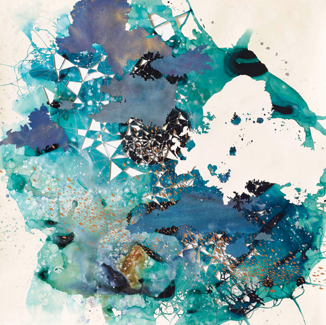
Val Britton, Littoral Zone, 2016, acrylic, ink, collage, and cut out paper, 50” x 50.” Courtesy of the artist and Gallery Wendi Norris, San Francisco.
Conceptually, my approach to making the work was to research the SFO site at the San Francisco Public Library’s Daniel E. Koshland San Francisco History Center, a rich archive of information-its history, the diverse population that travels through, weather patterns-and to synthesize the research visually, combining it with my own hand and visual language and extracting elements and symbols in order to create the piece. I used maps and plans of the airport, the bay, wind patterns, flight routes and topography to generate imagery. Of particular resonance for me in researching this history was the way in which SFO has repeatedly remade itself, redesigning and rebuilding on a fixed, partially landfill footprint with limited room for expansion. These layers of history are like palimpsests, traces of what was before, informing each subsequent iteration. I am also drawing from the contrast between elements of the site that are more constant, such as the architecture and land, and the elements of change, such as the seemingly unending flux of people from all over the world who pass through the site, the weather that constantly affects our ability to travel, and how the function of the airport shifts and evolves as our economy and lifestyle needs change over time.
I collaborated with Franz Mayer of Munich, an architectural glass and mosaic company based in Munich, to fabricate the panels. Working with the artisans at Mayer, I learned a great deal about the process and was surprised and excited by the way working in layers of glass resonated with my experience in printmaking and collage, which are both mediums in which images are built up in layers. I made two studio visits to Germany over the course of a year, during which time we determined which techniques would work best to translate the artwork into glass and made numerous samples.
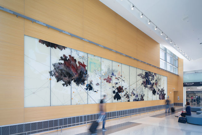
Val Britton, Voyage, 2015, laminated glass panels, ceramic glass melting colors, graphite and lacquer paint, 9 ½ x 55 feet. Commission for the San Francisco International Airport control tower, completed Summer 2015. Courtesy of the artist and Gallery Wendi Norris, San Francisco.
We translated a work on paper that I made to scale using drawing, collage and painting into glass. The glass panels are installed in the wall and have an opaque back layer, so rather than functioning as a window, the piece functions as a painting. The panels consist of two layers of glass that are laminated together using a clear silicone interlayer. Since each layer of glass is transparent and consists of a back and front layer, we had a total of four surfaces of glass to work with, which were essentially sandwiched together. Each layer of glass contains different information, so the resulting work has a subtle floating and shifting quality between layers as the viewer walks past it.
We used a variety of techniques on the glass: hand painting using ceramic melting colors which gave a translucent watercolor effect and were fired in the kiln, sometimes in multiple layers/firings to achieve the desired colors and effects; etching the glass with a sandblasting technique to create a tactile layer and filling the etched areas with pigment, some of it metallic, some black; using stencils to create hard edges between painterly areas; painting with cold lacquer for an opaque back layer; and drawing with graphite on a layer that was first sandblasted to hold the tooth of the graphite.
Working with a structural engineer, we designed a system in which a steel ledge was built into the wall with U-shaped brackets at the top and bottom of the artwork. Each panel slid into this U-bracket ledge system, which holds the panels in place and is strong enough to bear the enormous weight of the glass. The small vertical gaps in between each panel were then sealed with a pigmented caulk. The wood veneer surface treatment which covers the entire wall extends over this steel system and integrates the piece into the surrounding architecture.
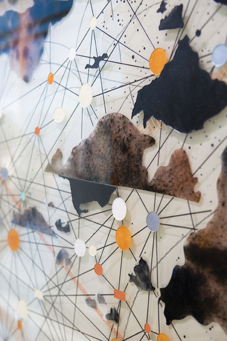
Val Britton, Voyage (detail), 2015, laminated glass panels, ceramic glass melting colors, graphite and lacquer paint, 9 ½ x 55 feet. Commission for the San Francisco International Airport control tower, completed Summer 2015.
This was a rewarding project to work on. I learned about new materials, which had a reverberating effect on my studio work in that it opened up new ideas about making for me and how to potentially work differently, expanding what I can do. Working collaboratively with a fabricator, I realized that I can accomplish more ambitious projects with a team than I can do on my own, and this is an exciting branch of my practice that I’ve continued to pursue. But one of the best outcomes for me was the collaboration with the studio and how we were able to retain the handmade feel of the artwork even though we produced it on such a large scale. Before this project, I had preconceived notions about working with fabricators, that I had to relinquish a great deal of control to them or the work would be largely created with technology and look cold or computerized. In fact, the majority of the work was made by hand-hand painting, hand stenciling, etc. by the artisans at Mayer and even by me during my last studio visit to Germany. I was able to remain a close collaborator and art director of my work. I feel that the resultant piece retains the tactile, haptic quality that is such an essential element of my work, and I’m very proud of the final installation.
Scott Thorp is an artist, writer and educator specializing in creativity. He is chairperson of the Department of Art at Augusta University, as well as a contributing writer and editor for ARTPULSE. Additionally, he serves on the board of directors for Westobou Festival and is vice president of the Mid-America College Art Association. With an MFA in drawing and painting from the Mount Royal Graduate School at The Maryland Institute College of Art, he has exhibited often in museums and galleries in the Mid-Atlantic region of the U.S., including the Corcoran Gallery of Art.









Leave a Reply
You must be logged in to post a comment.